day ruined
It's missing the Clippy button in the taskbar
1. Be civil
No trolling, bigotry or other insulting / annoying behaviour
2. No politics
This is non-politics community. For political memes please go to !politicalmemes@lemmy.world
3. No recent reposts
Check for reposts when posting a meme, you can only repost after 1 month
4. No bots
No bots without the express approval of the mods or the admins
5. No Spam/Ads
No advertisements or spam. This is an instance rule and the only way to live.
day ruined
It's missing the Clippy button in the taskbar
Also missing the handy celebrity gossip, weather and irrelevant stonks shit that pops up every time you mouse past it in the Taskbar.
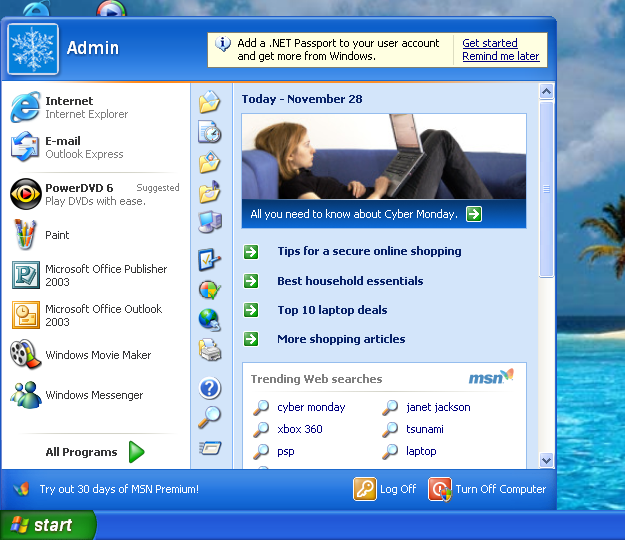
WinXP was good
I mean, Windows 98's "Active Desktop" was pretty much this.
Someone at Microsoft has been trying to make MSN a thing for almost thirty years, and they're sure that if they ram it down out throats just one more time we'll finally accept it.
That's not nearly shitty enough. It's too useful. Look at all the options and other clickable things you got on the start menu, and it only took one click to open it.
That's not how this works anymore. If this were truly made today, it would be needlessly "streamlined", i.e. everything is hidden so as not to "clutter up" the UI with useful things, and make more room for...nothing. Just wasted space.
We hide everything behind multiple clicks now because the "average user" starts bleeding out their eyes if they're forced to see many things at once.
Also, icons. The icons in Windows XP are too recognizable. You need to minimalize them. In fact, minimalize it so hard that not one person could understand what the icon is even referring to.
Abstract art icons.
Folder: rectangle on its side. Start: triangle pointing up. Trash: rectangle standing up.
That [Yes] [Remind Me Later] thing is so 2007...
Nowadays Windows features all have a definitive [Off] option, that will fully hide the feature from view and only enable a daily message that pops under your mouse so you can turn it back on any time you want.
Where the crypto and AI bloat?
yea, where are pinned apps in the task bar?
We need AI Clippy.
Honestly if Microsoft reintroduces the skeuomorphic UI I'll tolerate any bullshit they pull. It's just objectively pretty IMO.
Also this start menu doesn't have nearly enough useless negative space. Here is my work Win11 start menu for comparison:
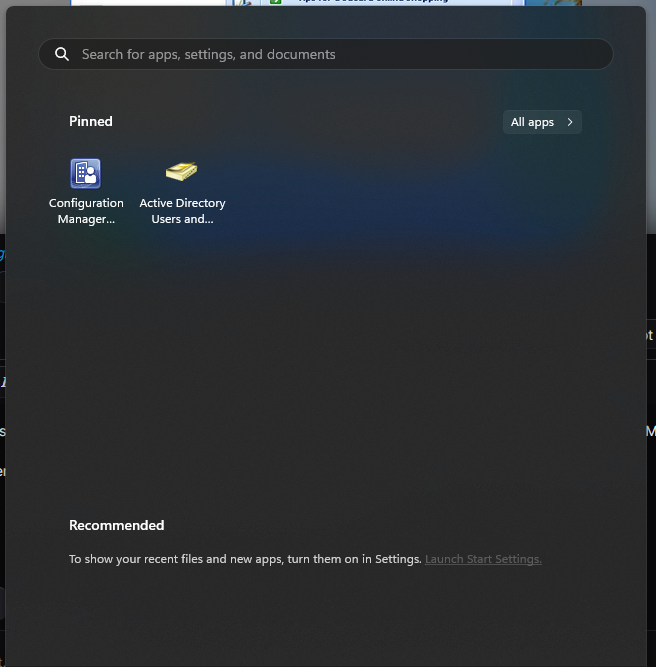
Somehow this still looks better than W11
It's the full start menu with one click, and the toolbar isn't needlessly centered, so yeah. I'd actually take this over Win11
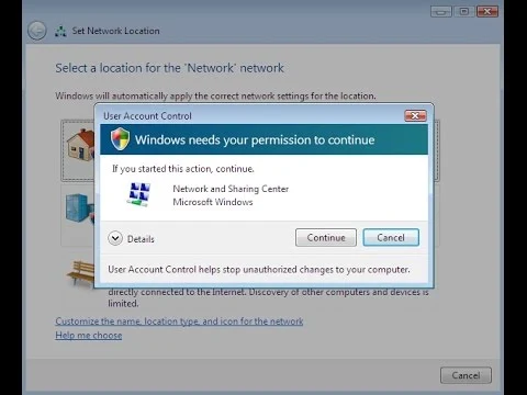
"Turn off computer" requiring admin privilege escalation is a clever touch.
Actually it’s even more realism, when the shield is on the power button it indicates pending updates.
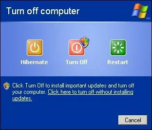
OOP knows their stuff!
Wow... that's really intricate and sure is attention to realism to a level I didn't realize.
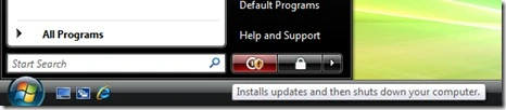
Also the more or less hidden "click here to power off without installing updates" shows how little Microsoft has changed.
That option was actually fully removed in 8 I believe, then restored in 11 (and newer versions of 10 iirc?) because everyone hated it so much lol
Also I think it was Vista that replaced the flag shield on the power button with a yellow exclamation mark shield instead to differentiate it from the new UAC which used the flag shield logo
edit: images bc i love this stuff lol
@mypasswordis1234@lemmy.world your credit link isn’t actually the original artist. Here is their Deviantart, thanks to the kind internet soul who helped me last time this was posted :)
whoever downvoted this im in ur walls
Look at how they massacred my boy....

Your username is a god damn lie, please fix it
WRONGGGG!! No one would be using an MS Office version that is 21 years old.