Ladies and gentlemen, we're royally fucked.
A place to share and discuss data visualizations. #dataviz
(under new moderation as of 2024-01, please let me know if there are any changes you want to see!)
Ladies and gentlemen, we're royally fucked.
If it was possible I would put quite some money on that geo engineering (like stratospheric aerosol injection) will be seriously discussed on a UN level within ten years. Climate change seems only to speed up and co2 emissions are still rising. At one point there is simply no alternative.
I also think that this is what will happen (not only discussed) but unless we master fusion it's practically just fixing a symptom and we'd have to do that for quite a while and the oceans will probably become too acidic.
Fusion would solve a lot, but even if we invent room-temperature superconductors today, it would still take so much time to roll fusion out on a big scale and replace oil infrastructure with electric infrastructure.
I tend to be very pessimistic about climate change, but I hope I’m wrong.
Greta Thunberg talks about it in her book - if the bathtub is overflowing in your house and water is spilling across the floor everywhere, step 1 for most people is to turn off the water. Yes sure it is fine to look for towels and buckets to try to contain the damage (and I don’t even disagree with you that it’ll be needed), but that also assumes that they’ll work and there will be political support to deploy them at scale, instead of mustering up the political support to turn the fucking taps down since at this point that’s clearly needed and is relatively speaking much much easier.
I was more stating what I think will happen rather than wat we should be doing.
In terms of pure physics it is ofc easier to turn off the metaphorical tap, but in terms of power and politics we seem unable to transition to renewables. And I’m afraid once we switch on the geo-engineering button we still won’t transition. Only once oil is priced out of the market completely, be it fusion or abundant solar and wind (with energy storage), will we make the transition. But again I might be too pessimistic.
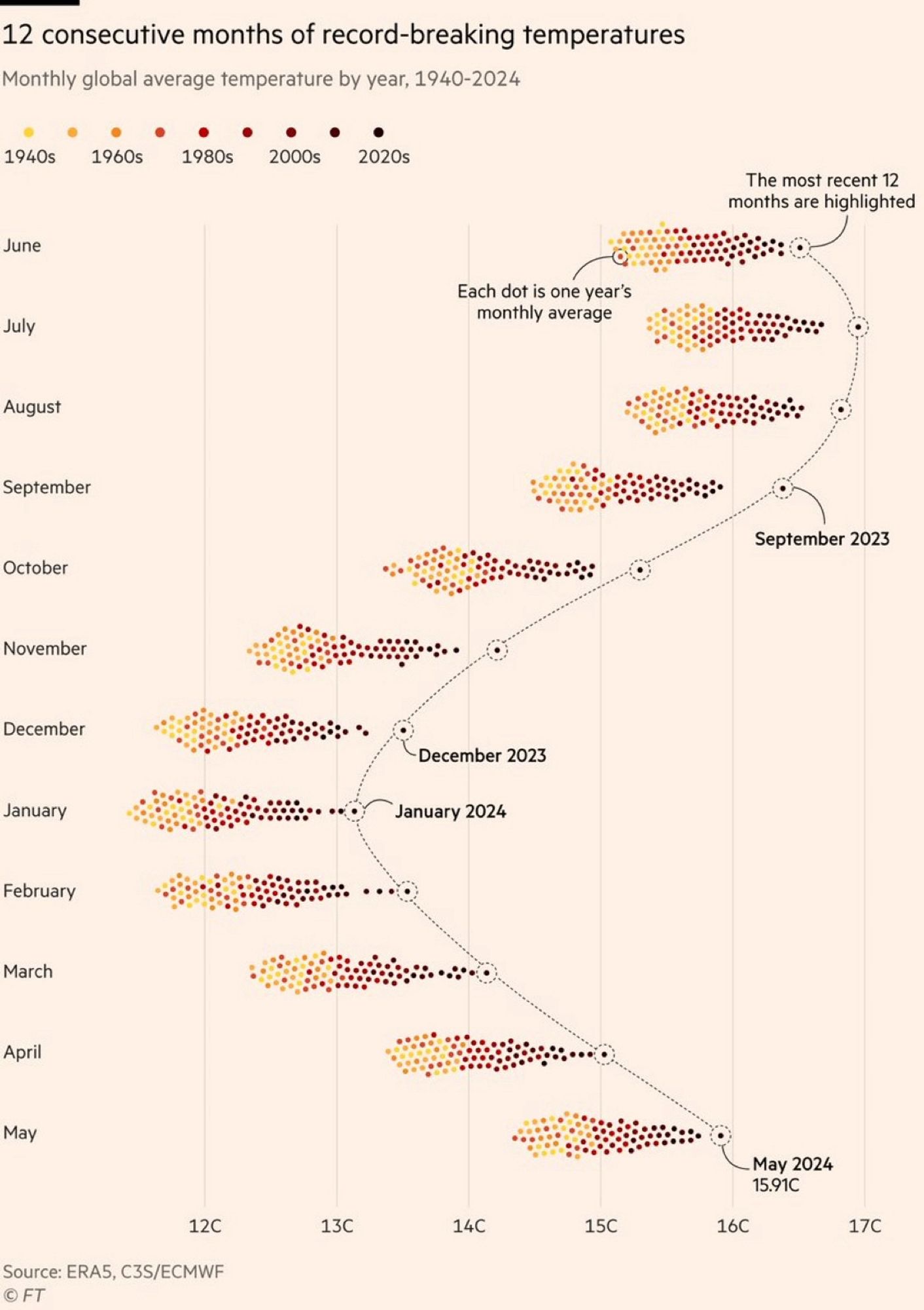
The color grading of the years is really bad. The last 20/30 years are all very low in contrast compared to each other, while 1940s and 60s are easy to tell apart, where it is least important. There are so many more colors than yellow/orange/brown, we can use them to get more information density.
Quite the contrary. I have a red-green deficiency (and so do about 6% of men). Viridis Color scale is pretty nice but two much colors are hard to read for a lot of people
We need to invent an image format that let's chart colorw be tweaked after the fact lol
Actually, that's a feature that was common going all the way back to the very earliest image file formats: https://en.wikipedia.org/wiki/Indexed_color
It'd be easy enough to make the chart a plain old GIF or indexed PNG; the only non-trivial part is that you'd need add some code to the page it's embedded in to swap out the color palette. (You could also make it an SVG and manipulate it even more easily using the DOM.)
Well, the image format is based on indexed color for compression purposes ... But it's not like it calls out "these indexes should be customizable".
Why does it seem like this is only the northern hemisphere and not truly "global"? Shouldn't it be warm in the southern hemisphere when it's cold in the north? So shouldn't these groupings generally hover around an average between northern and southern hemisphere temps?
What's your source that there's not warming in the southern hemisphere?
The temperature readings would look different because winter and summer are flipped, but they absolutely should be attributing a similar effect.
That's what I thought... But if it's winter in the north then it's summer in the south, so you'd expect them to average in a way that you wouldn't see such stark differences between say January and July. In July it's winter in the south, summer in the north. Intuitively I'd assume they'd average. Temps would still be rising year over year, but you wouldn't see a difference between months. A couple people have answered that it has to do with the earths tilt and the fact that there's more landmass in the north. Seems plausible I guess.
Huh... So it does. Interesting.