this post was submitted on 08 Jun 2024
3 points (100.0% liked)
Data Is Beautiful
6733 readers
368 users here now
A place to share and discuss data visualizations. #dataviz
(under new moderation as of 2024-01, please let me know if there are any changes you want to see!)
founded 3 years ago
MODERATORS
you are viewing a single comment's thread
view the rest of the comments
view the rest of the comments
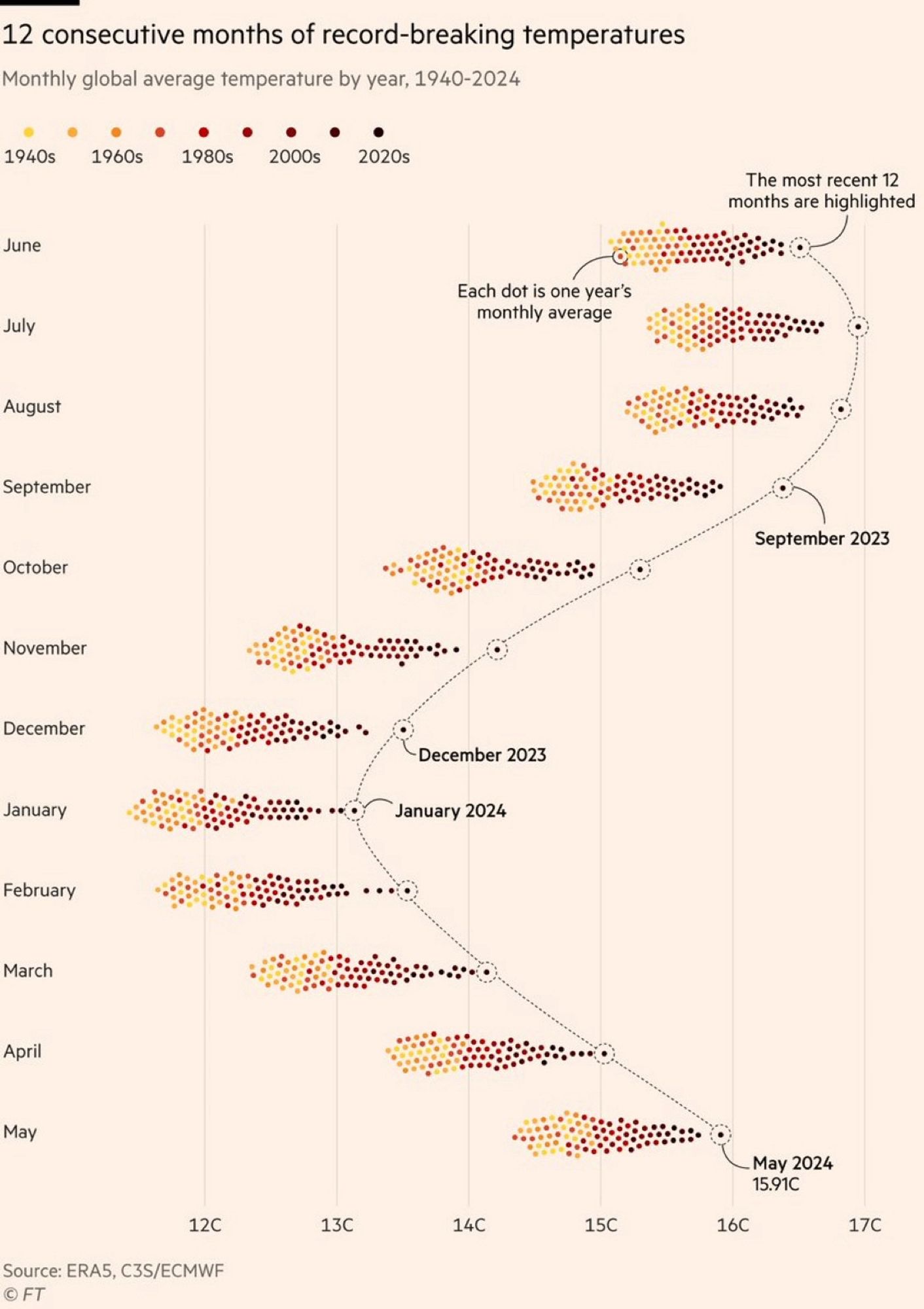
Why does it seem like this is only the northern hemisphere and not truly "global"? Shouldn't it be warm in the southern hemisphere when it's cold in the north? So shouldn't these groupings generally hover around an average between northern and southern hemisphere temps?
What's your source that there's not warming in the southern hemisphere?
The temperature readings would look different because winter and summer are flipped, but they absolutely should be attributing a similar effect.
That's what I thought... But if it's winter in the north then it's summer in the south, so you'd expect them to average in a way that you wouldn't see such stark differences between say January and July. In July it's winter in the south, summer in the north. Intuitively I'd assume they'd average. Temps would still be rising year over year, but you wouldn't see a difference between months. A couple people have answered that it has to do with the earths tilt and the fact that there's more landmass in the north. Seems plausible I guess.
Huh... So it does. Interesting.