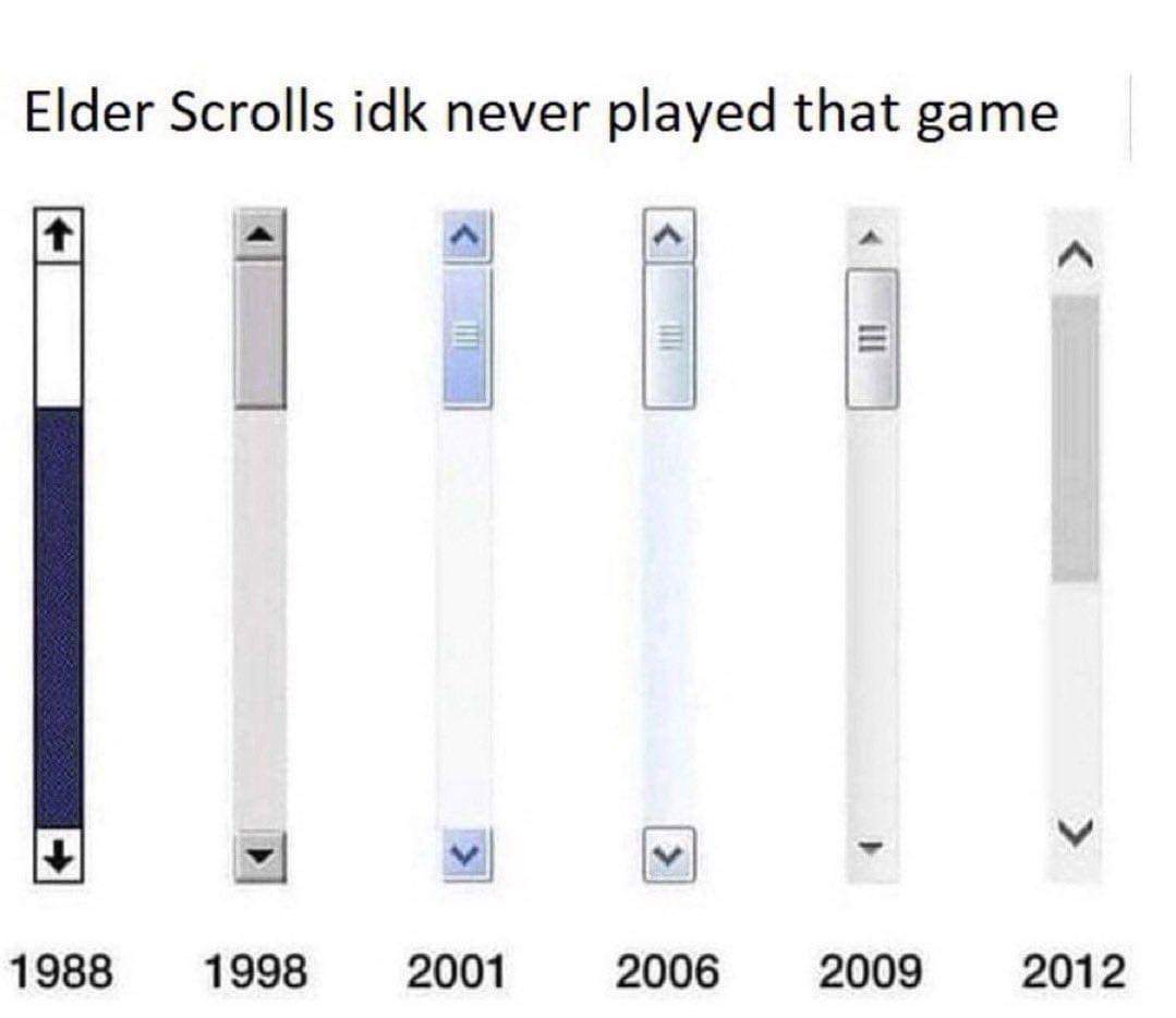
2024 is invisible, the current trend being that you aren't allowed to see anything you can scroll until you hover over it.
Gaming
!gaming is a community for gaming noobs through gaming aficionados. Unlike !games, we don’t take ourselves quite as serious. Shitposts and memes are welcome.
Our Rules:
1. Keep it civil.
Attack the argument, not the person. No racism/sexism/bigotry. Good faith argumentation only.
2. No sexism, racism, homophobia, transphobia or any other flavor of bigotry.
I should not need to explain this one.
3. No bots, spam or self-promotion.
Only approved bots, which follow the guidelines for bots set by the instance, are allowed.
4. Try not to repost anything posted within the past month.
Beyond that, go for it. Not everyone is on every site all the time.
Logo uses joystick by liftarn
I dislike this trend of invisible UI. I'm (usually) on a 4k screen, I've got plenty of room for it, it's not the early 2000s anymore; stop hiding the fuckin scroll bar or video progress bar
I think most people are on laptops now. Blows my mind but yeah.
My comparison is that screen size is like desk size. A laptop being those tiny pull out side desks at college, and a monitor being a desk. I was massively downvoted for that. People like their small screens.
I get a poked fun at a little bit on mechanical keyboard communities for preferring a full-size (I gotta type IP's, need a numpad!).
I don't think I could work solely on a laptop without external peripherals, it's just not a good experience (also giant hands and chiclet keys is not a good combo). My work laptop exists permanently folded closed connected to a dock.
I'd put the analogy as trying to cook a multi-course meal in a saucepan on a single burner vs a full stovetop and set of pans (also you only have a paring knife).
I like the trend of invisible UI. It keeps the display free of clutter and persistent UI elements (hello, OLED) and doesn't hinder usability at all. I hide scroll bars whenever possible because middle clicking is far more convenient than click-dragging. Hidden elements always appear by using a related action--moving the mouse reveals the play bar, scrolling reveals the scroll bar. It's completely intuitive. I even remove the forward, backward and reload buttons on my browser because gestures and shortcuts are just faster.
UIs are near-universally as clean and functional as ever.. at least on macOS. Windows appears to be a clusterfuck. Linux is alright.
And you're not allowed to see how much is left to scroll. Company decide everything for you. You just keep doing the income needful.
Only scroll after watching an ad
2001-09: textured so pointer can grip better
i hate when my pointer slips off >:(
lol just dip ur kerser in ruber u n00b
Sliders peaked in 1998
Wasn't the same after John Rhys-Davies left.
Really wasn't the same once Jerry left and we got his less talented brother.
1998 is the superior one.
Seriously 90s Windows design is actually pretty good in my opinion. Does a great job conveying functionality through shadows and highlights.
No way. It needs that grippy part so your cursor doesn't slide off.
2006 was peak computing. Computers, mp3 players, tons of other gadgets. It was when technology was still fun.
Before social media and the tech giants enshittenified the internet.
it could be again, you know. more so, even.
Huh? 2001 and 2006 are the same (luna blue, luna silver)
Big if true!
Lol
Looks to me like the cycle is about to come back around to the textured scroll bar, and I am so here for it
I enjoy how you could put the 2012 design between 1988 and 1998 and it would hardly look out of place.
Look ma! I'm in the pic!!
When you're finished palying that please take a look at these slides
I recently got into eso again. Some of the lore can be a bit questionable, but it's a fun game with some nice lore bits. I'm also glad that TES VI has not been released yet, I only recently finished my formal education and that game might have interfered.
How long have you been off Windows? It's already at VII. Or VIII, I can't tell.
