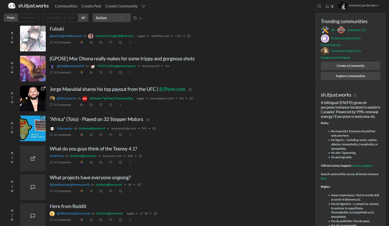
this post was submitted on 13 Jun 2023
0 points (NaN% liked)

Lemmy Plugins and Userscripts

2132 readers
1 users here now

A general repository for user scripts and plugins used to enhance the Lemmy browsing experience.

Post (or cross-post) your favorite Lemmy enhancements here!

General posting suggestions:

Thanks!

founded 1 year ago
MODERATORS
 

userscript called "old.reddit" found here: https://github.com/soundjester/lemmy_monkey

  • (recently updated for Lemmy v0.18)

  • original thread link here

  • This is primarily for desktop clients. At the moment, formatting get a little crazy below 1280 px wide. There are ways to address this, but I have not at this time.

  • script will be updated as suggested

    • significant changes have been made to address alignment, spacing, and other format issues. v1.1 will be where I stop for a while.
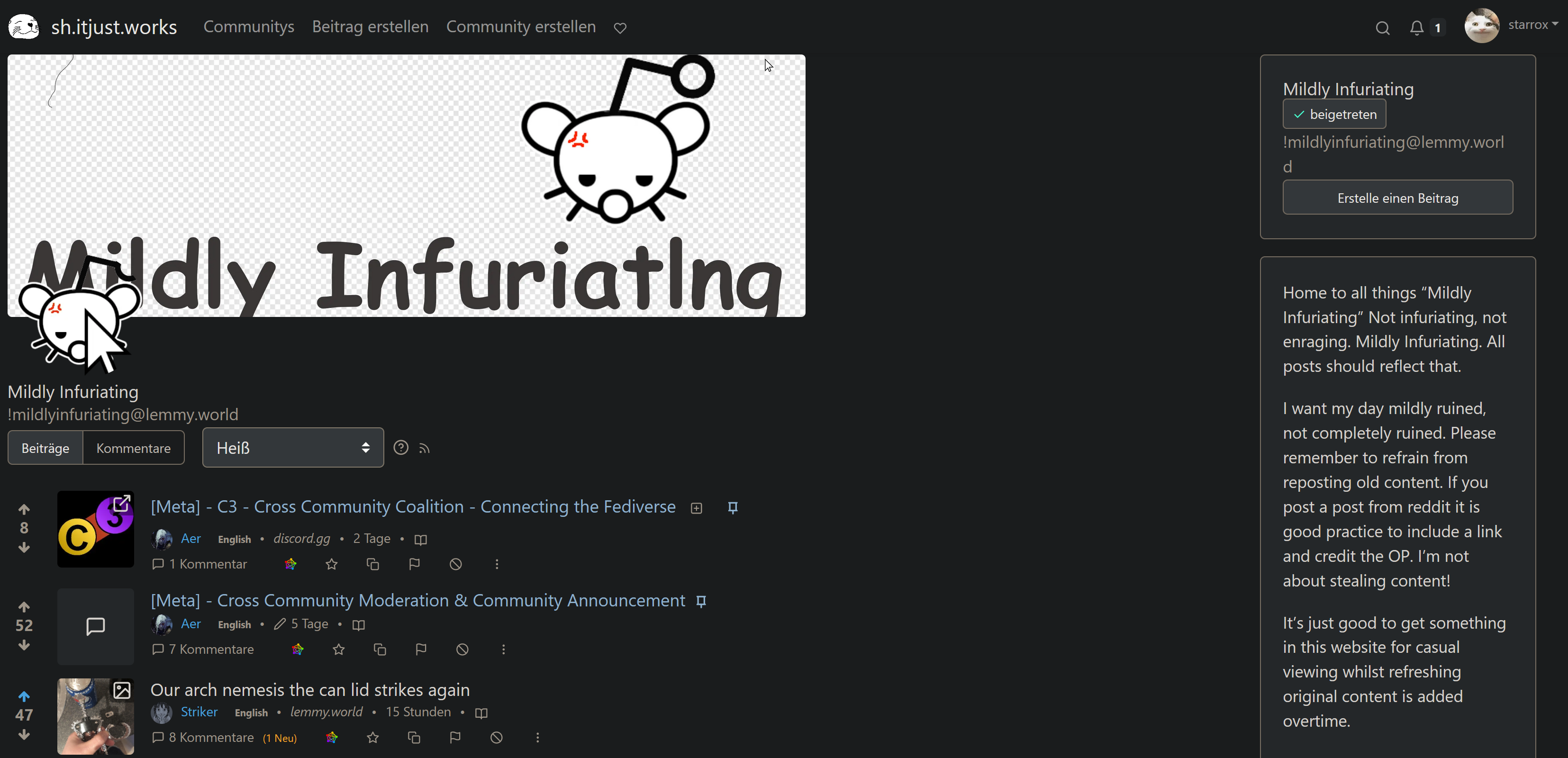
  • there are two script versions: old.reddit and old.reddit.compact. The primary difference is that the "compact" version greatly reduces thumbnail size and padding space.

  • notice: current script unblurs NSFW

(linked thumbnail shows old.reddit.compact version of the script)

Screenshot of old.reddit script results:

top 6 comments
sorted by: hot top controversial new old
[–] NoisyFlake@feddit.de 0 points 1 year ago

Awesome work! Would it be possible to add the "expand image/video/text" button from RES? Preferably with the option to increase/decrease the size of images by dragging with the mouse.

I'm talking about these: https://imgur.com/a/1yH5FTN

That would perfect my experience!

[–] mershed_perderders@sh.itjust.works 0 points 1 year ago (1 children)

I don't want to pat myself on the back TOO hard, but I just browsed through 44 pages of content and it was SO NICE and easy on the eyes.

[–] starrox@sh.itjust.works 0 points 1 year ago (1 children)

Nah man you can pat yourself. My 4k resolution is finally utilized and I am very happy with how almost everything looks.

Some community headers get scaled pretty wonky, for example in https://sh.itjust.works/c/mildlyinfuriating@lemmy.world but thats a small price to pay for more visual clarity overall.

Thank you for the great work!

[–] mershed_perderders@sh.itjust.works 0 points 1 year ago (1 children)

I added a line to restrict the banner width to a lemmy-native 730px - this should keep banner images looking as intended... Check out the update and see if that fixes the issue. (link for good order: https://github.com/soundjester/lemmy_monkey)

[–] starrox@sh.itjust.works 0 points 1 year ago (1 children)

Wow that was fast! Although I'm not 100% sure its better (for high-res at least).

Here's how it looks for me on a 3840x2160 resolution and 110% zoom:

But I think I understand the technical reasons beyond your change. It should be universally applicable and not just on 4k res.

I think it still would look best if the banner is spanning the whole top, maybe up to the community-sidebar on the right (1) or even beyond that (2). I tried to highlight 1 & 2 in this poor greenshot cap :)

Anyway, thanks for your great work!!

[–] gandalf_der_12te@feddit.de 0 points 1 year ago

I think having a slim banner is better, because it takes away less precious space on smaller screens. Remember that not everyone has huge monitors, many use web browsers on laptops and the like.