this post was submitted on 13 Jun 2023
0 points (NaN% liked)
Lemmy Plugins and Userscripts
2145 readers
1 users here now
A general repository for user scripts and plugins used to enhance the Lemmy browsing experience.
Post (or cross-post) your favorite Lemmy enhancements here!
General posting suggestions:
- Preface the submission with the type of enhancement - ex: [UserScript].
- Include a screenshot of the enhancement in use (where possible)
- Indicate the requirements for use (eg, greasemonkey, stylus, etc.)
Thanks!
founded 1 year ago
MODERATORS
you are viewing a single comment's thread
view the rest of the comments
view the rest of the comments


Wow that was fast! Although I'm not 100% sure its better (for high-res at least).
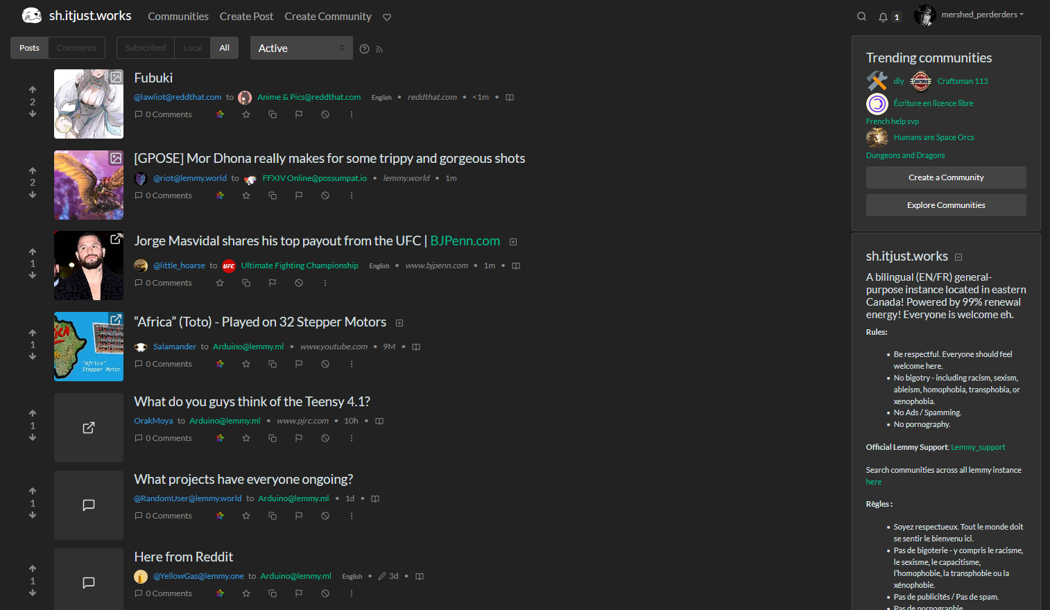
Here's how it looks for me on a 3840x2160 resolution and 110% zoom:
But I think I understand the technical reasons beyond your change. It should be universally applicable and not just on 4k res.
I think it still would look best if the banner is spanning the whole top, maybe up to the community-sidebar on the right (1) or even beyond that (2). I tried to highlight 1 & 2 in this poor greenshot cap :)
Anyway, thanks for your great work!!
I think having a slim banner is better, because it takes away less precious space on smaller screens. Remember that not everyone has huge monitors, many use web browsers on laptops and the like.