fasterandworse

joined 1 year ago
MODERATOR OF
[–] fasterandworse@awful.systems 4 points 6 days ago* (last edited 6 days ago)

this is cool. Considering their first album was all songs about accepting death I assume they're not fans of anything tescreal adjacent

I love that album, and i'll never forget when I was dating someone who was a classical pianist, the type that closes their eyes and sways their head when listening to classical, and when I put that album on it was a few notes into the first song and she made this tortured face and said "no, no, no! those chord progressions are so depressing!" It was so strange to me to hear that, but you know how you just know when someone knows what they are talking about and she was sure it had hit some kind of melancholy brown note.

Still... that era of interpol and white lies was great. That shit made me happy

I hear you, but I didn't say flat ui is due to processing power. My line of thought is that a sudden bump in available processing power might prompt designers to feel that elaborate uis are fine now because despite flat ui not being an efficiency thing, it is definitely perceived as one by the average designer who doesn't know how much of the css used to render it is generated client-side via js

yeah but I didn't say that flat ui was created for efficiency. Any efficiency of a flat ui is cancelled out by the excesses of client-side JS. I know it is fashion, I was there. But I also know that there is a sense that it is efficient by the designers that design with it.

[–] fasterandworse@awful.systems 7 points 1 week ago (1 children)

that;s exactly the catch I was hoping wouldn't be the case. When the AI shit is abandoned, is the hardware useful for regular stuff...

So, from what you're saying: Generative AI is fucking up in the past, present, and future

[–] fasterandworse@awful.systems 7 points 1 week ago (11 children)

is this a possible thing: all the AI assistant stuff being forced onto us in the next gen hardware is gonna need significant computing power bumps to support it, is this creating a potential surplus of computing power in all devices that could time very well with an excessive skeuomorphic UI design response to the decade of bland flatness we've endured that's gonna cook the cpus on the devices of everyone else?


I just published this on our new WriteFreely instance. It's a write-directly-into-the-cms-and-hit-publish job that took an hour. It's about the difference between the purpose of a thing and the purpose of the ux designers who work on that thing.

P.S. I skim proof read it. So expect weird gibberish (ha)

[–] fasterandworse@awful.systems 16 points 1 week ago (1 children)

sorry, can't let this post go without calling out the greenwashing ecosia that has a chatgpt integration while they only report their own energy stats with a limp "it's too early to tell uwu" when it comes to openai as a provider

[–] fasterandworse@awful.systems 9 points 2 weeks ago (1 children)

Afterwards I was thinking it could also pass as an emo album name. I wonder if there is a good guessing game in "metal album title or emo album title?"

[–] fasterandworse@awful.systems 20 points 2 weeks ago (4 children)

The earth is our coffin and hope is a mistake.

such a metal album name

[–] fasterandworse@awful.systems 11 points 2 weeks ago

like adding bacteria to a petri dish

[–] fasterandworse@awful.systems 9 points 3 weeks ago

I call this the law of conservation of complexity

[–] fasterandworse@awful.systems 6 points 3 weeks ago

sorry if my reply sounded rude. I didn't mean it to be. I just saw it again and it sounds dismissive.

[–] fasterandworse@awful.systems 8 points 3 weeks ago (1 children)

It's definitely the prudent option but I'm over mental capacity and I'd be lying if I said I wasn't sharing this just for the upvotes. I couldn't see any mentions of the sponsor in the comments, so I guess the audience, at least, were duped. I already have a string of unanswered questions on ecosia's greenwashing social posts, though

 

invidious link https://inv.nadeko.net/watch?v=OkfzjmY9cF8

He has sample photos starting around 12 minute mark - the colour tone he's getting is amazing

Example:

Colour photo of piled up old computers and computer peripherals from the grey/beige era. The colours are muted but not completely desaturated. It resembles film more than the average post-processed digital photo


I just want to share a little piece of this provocation, but would like to know how compelling it sounds? I've been sitting on it for a while and starting to think its probably not earning that much space in words. The overarching point is that anyone who complains about constraints imposed on them as being constraints in general either isn't making something purposeful enough to concretely challenge the constraints or isn't actually designing because they haven't done the hard work of understanding the constraints between them and their purpose. Anyway, this is a snippet from a longer piece which leads to a point that the scumbags didn't take over, but instead the environment evolved to create the perfect habitat for scumbags who want to make money from providing as little value as possible:

The constraints of taking up space

Software was once sold on physical media packaged in boxes that were displayed with price tags on shelves alongside competing products in brick and mortar stores.

Limited shelf space stifled software makers into making products innovative enough to earn that shelf space.

The box that packaged the product stifled software makers into having a concrete purpose for their product which would compel more interest than the boxes beside it.

The price tag stifled software makers into ensuring that the product does everything it says on the box.

The installation media stifled software makers into making sure their product was complete and would function.

The need to install that software, completely, on the buyer’s computer stifled the software makers further into delivering on the promises of their product.

The pre-broadband era stifled software makers into ensuring that any updates justified the time and effort it would take to get the bits down the pipe.

But then…

Connectivity speeds increased, and always-on broadband connectivity became widespread. Boxes and installation media were replaced by online purchases and software downloads.

Automatic updates reduced the importance of version numbers. Major releases which marked a haul of improvements significant enough to consider it a new product became less significant. The concept of completeness in software was being replaced by iterative improvements. A constant state of becoming.

The Web matured with advancements in CSS and Javascript. Web sites made way for Web apps. Installation via downloads was replaced by Software-as-a-service. It’s all on a web server, not taking up any space on your computer’s internal storage.

Software as a service instead of a product replaced the up-front price tag with the subscription model.

…and here we are. All of the aspects of software products that take up space, whether that be in a store, in your home, on your hard disk, or in your bank account, are gone.


Authors have expressed their shock after the news that academic publisher Taylor & Francis, which owns Routledge, had sold access to its authors’ research as part of an Artificial Intelligence (AI) partnership with Microsoft—a deal worth almost £8m ($10m) in its first year.

On top of it all, that is such a low-ball number from Microsoft

The agreement with Microsoft was included in a trading update by the publisher’s parent company in May this year. However, academics published by the group claim they have not been told about the AI deal, were not given the opportunity to opt out and are receiving no extra payment for the use of their research by the tech company.

10
A Rant about Front-end Development (blog.frankmtaylor.com)
submitted 4 months ago* (last edited 4 months ago) by fasterandworse@awful.systems to c/techtakes@awful.systems
 

A masterful rant about the shit state of the web from a front-end dev perspective

There’s a disconcerting number of front-end developers out there who act like it wasn’t possible to generate HTML on a server prior to 2010. They talk about SSR only in the context of Node.js and seem to have no clue that people started working on this problem when season 5 of Seinfeld was on air2.

Server-side rendering was not invented with Node. What Node brought to the table was the convenience of writing your shitty div soup in the very same language that was invented in 10 days for the sole purpose of pissing off Java devs everywhere.

Server-side rendering means it’s rendered on the fucking server. You can do that with PHP, ASP, JSP, Ruby, Python, Perl, CGI, and hell, R. You can server-side render a page in Lua if you want.

2
submitted 6 months ago* (last edited 6 months ago) by fasterandworse@awful.systems to c/morewrite@awful.systems
 

I just read Naomi Klein's No Logo, and despite being so late to that party It's not hard to imagine how big an impact it had in its time at identifying the brand being the product more than the things the businesses made (*sold).

Because I'm always trying to make connections that might not be there, I can't help think we're at a stage where "Brand" is being replaced by "UX" in a world of tech where you can't really wear brands on your shoulders.

We're inside the bubble so we talk in terms of brands (i.e. openAI) and personalities (sama), which are part of brand really, but outside of the bubble the UX is what gets people talking.

When you think about Slack doing their AI dataset shit, you can really see how much their product is a product of UX, or fashion, that could easily be replaced by a similar collection of existing properties.

As I write this, I already wonder if UX is just another facet of brand or if it's a seperate entity.

Anyway, I'm writing this out as a "is this a thing?" question. WDYR?


I found that the SerenityOS project also has a web browser with a completely new set of engines. It looks reasonably capable too.

Both LibWeb and LibJS are novel engines. I have a personal history with the Qt and WebKit projects, so there’s some inspiration from them throughout, but all the code is new. Not to mention, hundreds of people have worked on the codebase since I started it, all adding their own personal influences, so it’s definitely its own thing.

Edit: Here's a recent interview with the creator Andreas Kling talking to Eric Meyer and Brian Kardell about the browser https://www.igalia.com/chats/ladybird

Edit 2: Here’s their August 2023 update video of the browser https://youtu.be/OEsRW3UFjA0

Edit 3: Looks like the project was recently sponsored $100k USD from Shopify https://awesomekling.substack.com/p/welcoming-shopify-as-a-ladybird-sponsor

It’s quite impressive!

Note: I don't know anything about the politics of the SerenityOS project or the people behind it.


Laravel creator Taylor Otwell learned PHP in 2008

and then

There were a few model-view-controller frameworks for PHP, some of which aimed to provide a "Rails-like" experience. But none was as comprehensive as Otwell wanted. So he built his own and released the first version in 2011.

Taylor Otwell seems like someone who gets design. I've used Laravel a little bit and I know what they mean when they say "opinionated" - but I think the word doesn't do justice to his confidence in his design.

Anyway, this article came up in my twitter feed yesterday and it made me happy to hear Laravel is going strong.


Feedback types: Is this a thing? / challenging perspectives / general opinions

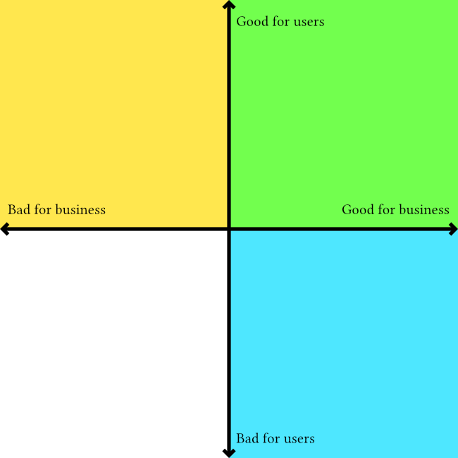
Here's an outline which I originally posted as a tweet thread but would like to flesh out into a fill article with images like the attached one to illustrate the "zones" that people may/may not realise they are acting in when they say stuff like "what's good for the user is good for the business"

I am writing this because I've published a few things now which say that empathy and "human centeredness" in commercial design, particularly UX design/research, are theatrical and not compatible with capitalism if done deliberately. That means they can be true as a side-effect, or by individuals acting under the radar of their employers. It has become common to hear the good for the user = good for the business response - and I want to write something that demonstrates how it is an incomplete sentence, and any way to add the necessary information to make it true results in the speaker admitting they are not acting in the interests of users or humans.

Here's the basic outline so far:

What’s good for the User

"What's good for the user is good for the business" is a common response I get to my UX critique. When I try to understand the thinking behind that response I come up with two possible conclusions:

Conclusion 1: They are ignoring the underlying product and speaking exclusively about the things between the product and a person. They are saying that making anything easy to use, intuitive, pleasant, makes a happy user and a happy user is good for business.

This type of "good for the user" is a business interest that values engagement over ethics. It justifies one-click purchases of crypto shitcoins, free drinks at a casino, and self-lighting cigarettes. https://patents.google.com/patent/US1327139

Conclusion 2: They are speaking exclusively about the underlying product and the purposes it was created to serve. They say a good product will benefit the business. But this means they are making a judgement call on what makes a product “good”.

This type of “good for the user” is complicated because it is a combination of objective and subjective consideration of each product individually. It is design in its least reductive form because the creation of something good is the same with or without business interests.

A designer shouldn’t use blanket statements agnostic to the design subject. “what is good for the user…” ignores cigarette packet health warnings and poker machine helpline stickers there because of enforced regulation, not because of a business paying designers to create them.

It’s about being aware of the context, intent, and whose interests are being served. It means cutting implied empathy for people if it is bullshit.

If we look at this cartesian plane diagram we can see the blue and green quadrants that corporate product design operates in. The green being where the "good for user, good for business" idea exists, and the yellow representing the area that the idea ignores, dismisses, etc

2
Welcome to MoreWrite! (awful.systems)
submitted 1 year ago* (last edited 1 year ago) by fasterandworse@awful.systems to c/morewrite@awful.systems
 

Hi, welcome to awful.systems' new writing community where we can help anyone who wants to share something more substantial in a blog post or article. I don't think it should matter what the writing is about or if it is fiction, non-fiction, researched academia or an opinion piece. It can help to have some one else look at it.

I am a practising writer who spends a bunch of time obsessing over a post for weeks and then just publishing it out of exhaustion. I've noticed improvements but definitely lacked the kind of feedback that a community like this could offer.

I would suggest that if you do post anything here you specify what kind of attention you would like. For example, are you looking for a critique of your assertions, creative feedback, or an unbiased editorial review?

Discussing your talking points when you just wanted some feedback about the narrative flow can end up having the reverse effect.

Feel free to post things you've already published as well. I don't think the state of the work matters as long as you give context and set expectations.

Thanks, and welcome again!


Thought it worth sharing among so much very, very questionable material I've found in reading through the reference material of this book, I came across ths Blake Masters + Peter Thiel connection.

It's my obsession sneer because of how celebrated this god damn book is among the fight for the user UX community.

I’ve mostly been reading the material but need to back up and do an author background check for each one.

https://web.archive.org/web/20200101054932/https://blakemasters.com/post/20582845717/peter-thiels-cs183-startup-class-2-notes-essay

view more: next ›