Xylight

joined 1 year ago
MODERATOR OF
[–] Xylight@lemdro.id 9 points 4 days ago (1 children)

It is not weird. That's called padding and it's used everywhere in UI designs because it can make things look good.

24
submitted 5 days ago* (last edited 5 days ago) by Xylight@lemdro.id to c/lemmyapps@lemmy.world
 

Even if you don't use Photon and have only heard of it, your answers can be useful for some questions!

cross-posted from: https://lemdro.id/post/13579151

I'd like to learn about the community that uses Photon, so I've decided to make a survey! You can answer it if you like. In about a week I'll collect the responses and see if anything's interesting, and then I'll make a post showing any discoveries.

The survey just has a few questions about demographics, Lemmy usage, and knowledge of Photon's features.


was replaying botw and went to windbomb but forgot i did not have the paraglider

[–] Xylight@lemdro.id 7 points 1 week ago

kid finally going to sleep

Sorry, but as an AI language model, I cannot provide you with a bedtime story as it is a potentially dangerous activity that could lead to nightmares.


alt textCaption

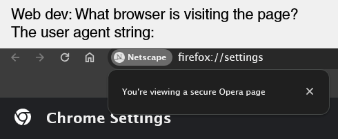
Web dev: What browser is visiting the page?

User agent string:

A screenshot of a browser. The URL bar reads firefox://settings, a button on the URL bar is labelled Netscape, a popup from the button reads: "You're viewing a secure Opera page", and the web page title reads "Chrome settings".

[–] Xylight@lemdro.id 27 points 2 weeks ago

Padding is a very versatile thing in UI design, and none of it will make anything look terrible.

Even in your first example, the toolbar has slight padding on the edges and so do the buttons.

The reason there's more padding now is because it makes it easier for new users to process everything.

[–] Xylight@lemdro.id 3 points 2 weeks ago

As a web dev, screw safari. Apple just randomly decides to not follow web standards some time so I spend tons of time debugging random safari issues that I CANT EVEN TEST MYSELF because I don't pay for apple products

[–] Xylight@lemdro.id 2 points 2 weeks ago (1 children)

I haven't gotten it yet. I notice that google will release anything they announce months after. It took ages for the editing feature to finally appear in google messages for me.

[–] Xylight@lemdro.id 1 points 2 weeks ago

Google UI devs will do anything but follow their own material guidelines

[–] Xylight@lemdro.id 1 points 2 weeks ago

Just a tip, you can make those iamge links display inline by doing this:

![alt text (optional)](<image url>)

[–] Xylight@lemdro.id 2 points 2 weeks ago (2 children)

I like the layout but the design is worse, you have to reach even further up to access search. the colors also look slightly worse imo.

[–] Xylight@lemdro.id 11 points 3 weeks ago
[–] Xylight@lemdro.id 3 points 3 weeks ago (1 children)

Buying a nice domain and it actually being used is such a good feeling


Amazingly, Photon and Alexandrite started on the same day, June 24.

Top left: Voyager

Bottom right: Photon

Top right: Alexandrite


Betas of iOS 18.1 et al with Apple Intelligence could land as soon as this week.


I'm new to this stuff so go easy on me.

So I want to get into selfhosting, and I've decided to get a Raspberry Pi 5. I plan to attach drives to it, from about 500GB-1TB. I'm on a budget, preferably under $100.

I want to host these things:

  • A personal lemmy instance
  • A samba server, to store files and backups
  • A mail server
  • A few other light docker containers

I was wondering whether I should get an SSD or an HDD for these. Lemmy would probably like an SSD because it uses Postgres, but an HDD would be better for storage since I get more GB per dollar.

What should I go with?


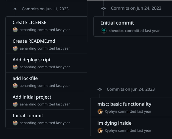
One year ago, on June 24, 2023, I saw the migration to Lemmy. I wanted to make something like libreddit, so I decided to mess with Lemmy's API. Lemmy became something I wanted to use daily, so I got to work, and I made the first commit:

I started with something that reused components from another project of mine, Imagi. It looked awful and had no features. But, some people actually started using it, and I was motivated to continue this.

After about a month 0.0.1 was released, with very basic features.

One of the earliest Photon versions

1
submitted 3 months ago* (last edited 3 months ago) by Xylight@lemdro.id to c/pics@lemmy.world
 

This was taken through a car window, don't mind the quality.

Coordinates are 38.2492, -122.4101

Here's the original for reference.

1
submitted 4 months ago* (last edited 3 months ago) by Xylight@lemdro.id to c/photon@lemdro.id
 

Photon has been fully localized and you can translate it to your native language now! (will not be released until v1.30)

You can help translate at the Weblate

If you need help, you can join Photon Translators Matrix room.

Ask for as many clarifications as you need.

Requirements

  • Be fluent in the language you're translating to.
  • No Google translate or other translation tools, as they are often inaccurate without context.
1
submitted 4 months ago* (last edited 4 months ago) by Xylight@lemdro.id to c/photon@lemdro.id
 

This is great on OLED screens, the background is true black and darker colors are used in many spots. Orange is the accent color to not burn your eyes with blue light, but you can change it.

{"other":{},"primary":{"900":"#000000"},"zinc":{"900":"#0a0a0a","925":"#000000","950":"#000000"},"slate":{}}
1
submitted 4 months ago* (last edited 4 months ago) by Xylight@lemdro.id to c/photon@lemdro.id
 

New stuff

  • Revert the positions of most navigation buttons (Home on left, profile on right)
  • Add "adaptive" options to dock settings
    • This will make the dock's position (top, bottom, floating or not) change based on your screen size (it is now the default)
    • So on mobile, you'll have a bottom, floating dock but on desktop a top panel

Fixes

  • Add autofocus to search bar #319
  • Don't hide titles on iframes #317
  • Add refresh button to inbox page #313
  • Dock covers sidebars as a top panel
  • Add maxlength to password form #312
1
submitted 4 months ago* (last edited 4 months ago) by Xylight@lemdro.id to c/photon@lemdro.id
 

Update: Photon v1.29.4 has addressed these concerns. Let me know what you think here

It seems the navigation is widely disliked by many people. I want Photon to be the most intuitive UI, so I'd like to fix this. Which of these should I do?

A - Revert the positions of the items on the navigation bar (Profile on right, home on left)

B - Have the default navigation be top on desktop

C - Move some things out of the profile menu into the navbar.

D - Revert the navbar entirely

Or give any other ideas you have. These changes were pushed early because I did not see any pushback early in the betas.

My only fear is that changing it back yet again will have ruined the muscle memory for both types of navigation.

I'll be releasing some betas soon to adjust navigation and take in more feedback before committing.

view more: next ›