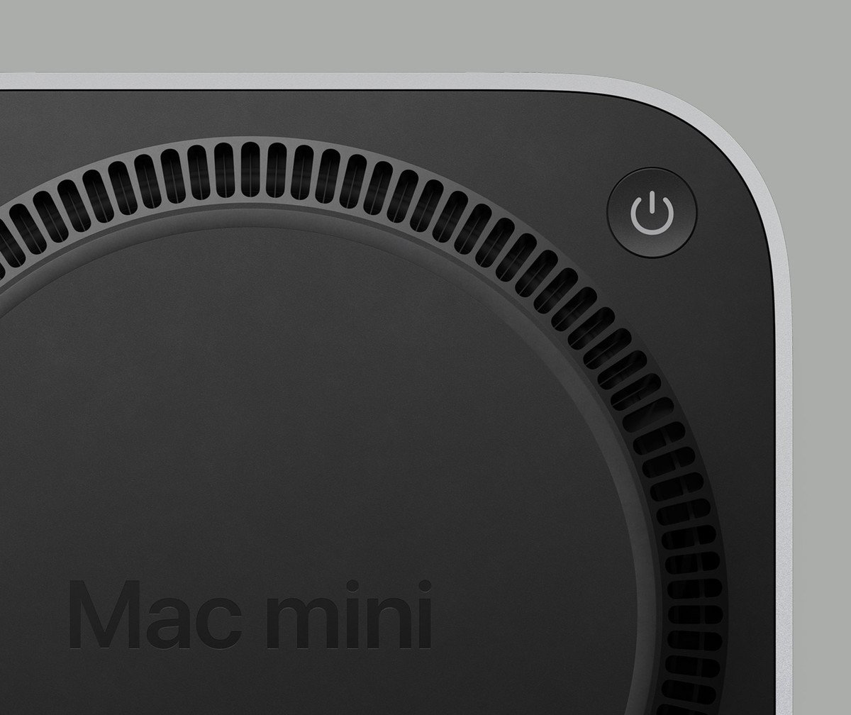
Mac Mini's are cool, and I appreciate that Apple has some of the most experienced and talented designers in the world... But they put the power switch on the bottom. You have to lift it up and turn it over to turn it on and off.

This is a most excellent place for technology news and articles.
Mac Mini's are cool, and I appreciate that Apple has some of the most experienced and talented designers in the world... But they put the power switch on the bottom. You have to lift it up and turn it over to turn it on and off.

Remember these are the same engineers who put the Magic Mouse charging port on the bottom, making the mouse unusable while you charge it
Honestly, the mouse charger screams marketing or management. Apple's brand is partially form over function.
People treat it like a mistake but not be able to use the mouse while it’s plugged in is the entire point of the design. Right or wrong the Apple designers thought a cord drag was a bad experience and designed to prevent it.
They probably looked at their target audience and realized there was a certain percentage of folks that would just leave the mouse on the cord 24/7 and wanted to prevent that.
They also know their target audience has plenty of people who gobble up every bad design decision and even defend it online years later.
People treat it like a mistake, but the Emperor has no clothes and people are catching on.
What.
The fuck.
In case it wasn't a joke, I imagine it would be high enough for your finger to just poke under it to push the button, like you would a monitor with buttons on the bottom of the screen.
The new design seems more lifted, I think it should be fine to fit your finger below there without having to lift it up yourself. At least for most people.
Power Bottom
The previous model has it in the back, you can’t even feel it properly because it’s not recessed.
On the other hand the last time I turned off my M1 mini was when we moved. It’s 100% silent and takes less power than a lightbulb when it sleeps, so why would I bother powering it off.
But once its on why would you ever turn it off? /s
I bought my iMac in March 2020... since then it's been powered down maybe half a dozen times (a couple of those were power cuts) and rebooted (outside of macOS updates) maybe ten times.
It just sits there reliably doing its thing and sucks little juice in power saving so 🤷🏻♂️
This but non-sarcastically. I have a Mac mini and I don’t think I’ve ever touched the power button (except after plugging in of course, but then you’re already fiddling)
But WHY??
Most, if not all, Apple devices look almost exactly the same as their sibling devices.
Well, it would be
That cilinder Mac Pro was a fever dream but I still love the design
more unstable if they shaped it like the magic mouse with the power port at the bottom
Sounds like someone didn't wear their Brave pants today
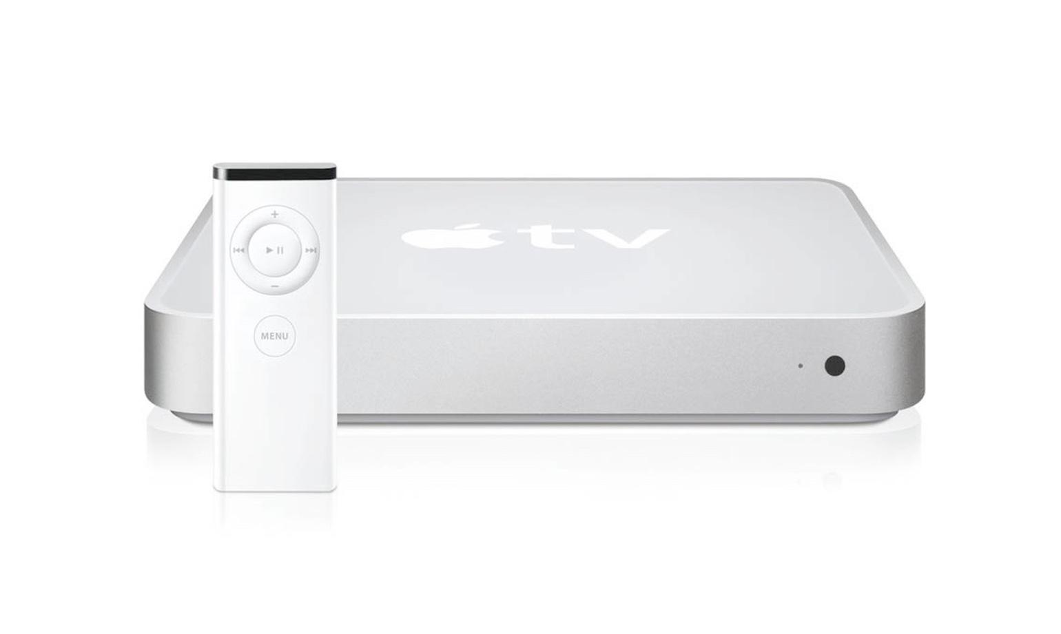
Implying Mac Minis haven't looked like Apple TVs from the beginning?
Mac Mini (2005-2009):

Apple TV (1^st^ gen, 2007):

Mac Mini (2010, first redesign after Apple TV came out):

It's kinda cute
I mean.. It looks like the other Mac minis so... Okay.