this post was submitted on 30 Aug 2024
1524 points (96.9% liked)
Memes
45726 readers
750 users here now
Rules:
- Be civil and nice.
- Try not to excessively repost, as a rule of thumb, wait at least 2 months to do it if you have to.
founded 5 years ago
MODERATORS
you are viewing a single comment's thread
view the rest of the comments
view the rest of the comments

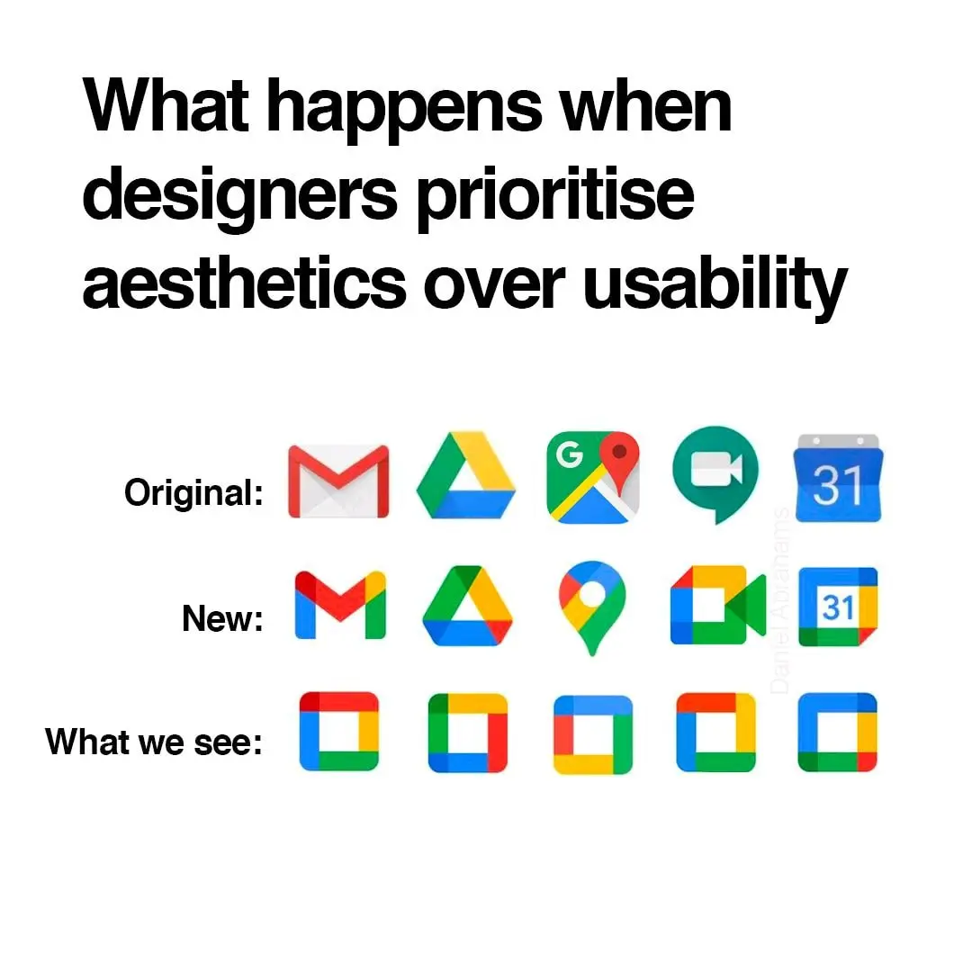
oh noooo icons sharing a common design language and color scheme? the absolute horror.
if you can't tell the difference between these icons i have a great educational resource for you
nah I still recognized all of them as google products bc they use the same 4 colors, but in different interesting ways. gmail was all red but a letter shape. Maps was a red pinhead. drive was a triangle but used all the colors but red. Calendar was a less noticeable shape but instantly recognizeable as a tabletop day calendar. now everything has to use all 4 colors and the shapes are so small that the colors can't do enough on a phone screen to differentiate themselves.
They already had a common design language and color scheme. Now they have a samey-ness to them that takes away visual interest.
Try harder, you can do better than this.