this post was submitted on 30 Aug 2024
1524 points (96.9% liked)
Memes
45712 readers
994 users here now
Rules:
- Be civil and nice.
- Try not to excessively repost, as a rule of thumb, wait at least 2 months to do it if you have to.
founded 5 years ago
MODERATORS
you are viewing a single comment's thread
view the rest of the comments
view the rest of the comments

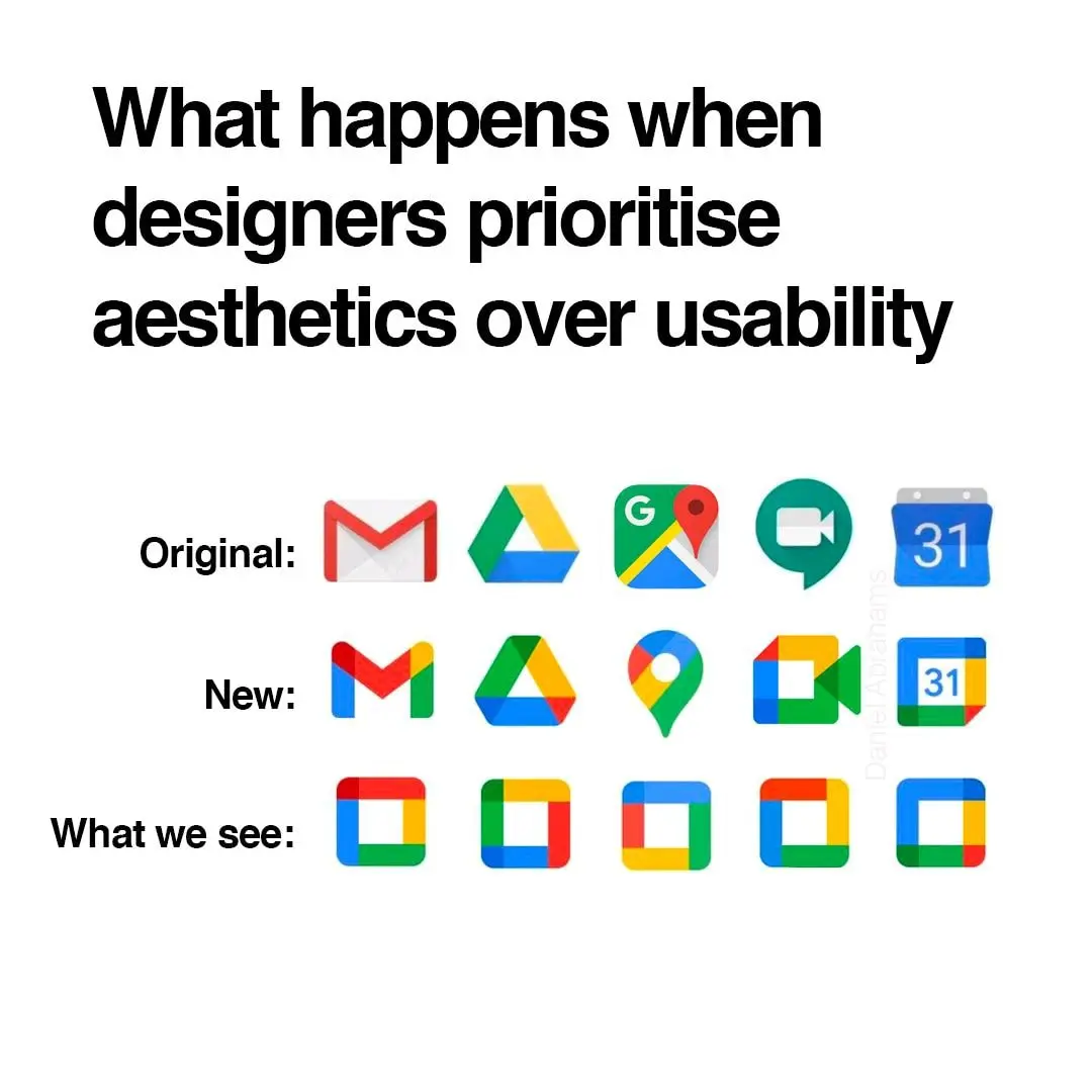
i think they did need to unify the design and branding but i also agree they went too far with it. if they had only chosen 1-2 colors for each app icon that would have helped a lot.
gmail - red
drive - yellow
maps - green
meet - blue
calendar - lighter blue
problem solved
Problem solved! If we ignore the world's ~300 million colorblind people.
is that the one that says "fuck the color blind" because if so hey!! that's not nice
Hey, color blind people deserve sex, too!
No way dude, it's the other one that says, "we love the color blind." Really.
Beat me to it.
i think they forgot to mention: they're not all the same shape.
True. Colorblind people come in all shapes and sizes.
Ah, the old Lemmy shapearoo
Worked for a few jumps but then it sent me to kbin with a 50x error 🤷
Edited my comment with a different link, should be a bit longer now
Hold my shape, I'm going in!
I'll hold your shape. 😏
oh no not again
Except that the original post was contesting that those shapes are indistinguishable from each other. My point, therefore, is that the solution offered in the post I replied to would still be indistinguishable to 300 million people.
the squares are there for comedic effect. the shapes are not actually indistinguishable. but at a glance, color is a much faster tool we use to identify these icons. so the problem here is that it takes longer for us to decipher a Google app icon, and the solution would be to differentiate the colors.
also this would help colorblind people as well, because removing unnecessarily complicated colors would make the shapes easier to identify as well.
Yes I understand the meme and I'm not trying to get into an argument. I'm just trying to educate as to why relying on color as the primary differentiator is not a solution to the problem as proposed.
Think about what you're saying here, and consider how ridiculous it would sound if you said that to someone who was completely blind.
Sure, to a "color normal" person, something's color is a great differentiator, but even when using a colorblind friendly pallette it's just far easier for us to distinguish different shapes than colors. We've spent our whole lives adapting to a lack of color information so asking us to be able to work purely on color alone is like asking a blind person to see.
Again, and this part is really important and oft overlooked - this applies even when a designer has gone out of their way to choose a colorblind friendly pallette. It's just not that easy for us. I honestly couldn't even tell you what Google's corporate pallette is without looking and I'm sure that information is second nature to normies.
this image has two groups:
at first glance did you separate it into red v blue or circles vs squares?
you're absolutely making things up. we've evolved to differentiate shades as well, which supercedes colors. even for colorblind people this kind of image should be differentiated by color or shade first.
not to mention not all people have perfect vision, in fact people with blurry vision probably outnumber colorblind people, and that would make the shapes not extremely reliable, especially when most icons would be more or less squares and circles with small details changed.
I could tell you what I see but you wouldn't believe me anyway.
I was trying to show that not everyone perceives the world around them in the same way, and most people find it fascinating when they take a step back to really think about it. But you've already decided that simply not being able to see colors in the same way as you makes me inherently wrong, so I'm not going to engage any further.
The icons would still have different shapes, right?
No, it would just be the 🤣 emoji in different colors.
Which is how they are now
Yes, but the original post is suggesting that they're ambiguous enough to all be squares. Running with that concept, making a bunch of squares different colors doesn't fix the issue for those of us who can't easily identify those colors.
Most software pretty much doesn’t give a fuck about the visually impaired despite everyone talking big shit about accessibility. So I could certainly give a fuck what color someone’s logo is.
then what is your solution? do you expect them to redo their entire corporate branding palette?
Nope. The icons are honestly good enough as they are, but the original post was being disingenuous in suggesting they're no more distinguishable than squares.
Running with that logic, having each square a different color does not solve the problem for those of us who can't easily distinguish those colors.
it's a meme, so obviously it's hyperbolic. but the point is valid.
It's called goluboy. In Russian at least.