this post was submitted on 18 Aug 2024
1496 points (99.1% liked)
Technology
59599 readers
2774 users here now
This is a most excellent place for technology news and articles.
Our Rules
- Follow the lemmy.world rules.
- Only tech related content.
- Be excellent to each another!
- Mod approved content bots can post up to 10 articles per day.
- Threads asking for personal tech support may be deleted.
- Politics threads may be removed.
- No memes allowed as posts, OK to post as comments.
- Only approved bots from the list below, to ask if your bot can be added please contact us.
- Check for duplicates before posting, duplicates may be removed
Approved Bots
founded 1 year ago
MODERATORS
you are viewing a single comment's thread
view the rest of the comments
view the rest of the comments

I don't know, but I also don't know why would anyone willingly choose this UX for their website.
Writing sign-in and authentication can be difficult. Google handles it for you. They'll also store all of the secret stuff that you don't want to leak, like passwords, etc. So I can see some of the appeal for sites of a certain size, but not really Twitter.
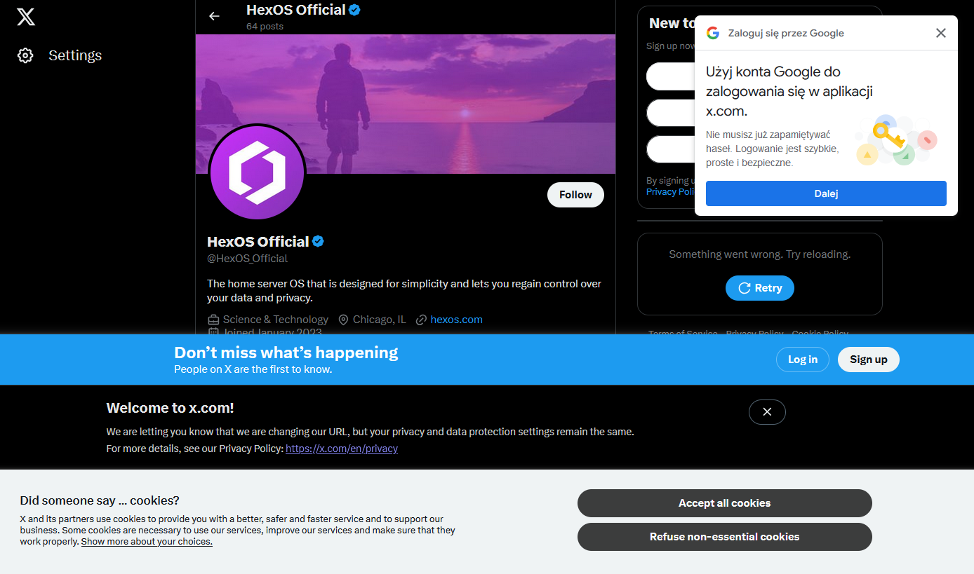
I can understand that, and a user can also enjoy the simplicity of the process. However, I'm speaking about this very popup here. It doesn't have to be this way. There are plenty of websites that allow you to sign in/up with Google (or another 3rd-party provider) that don't have this problem. I see so many websites and mobile apps that make it very difficult to use them. I always wonder if anyone at the company is using their own website/app. Reddit is another great example.
Oh right, yeah, it really irritates me. I'm sure it comes from some Growth Team experiment where the only success metric was interactions (intentional or accidental) with the box.
Making the box increased engagement with the box, ship it!