Open Source Fonts

366 readers
9 users here now

A place to talk about free and open source typography, to show your discoveries or creations or to talk about anything else related to this theme.

founded 4 years ago
MODERATORS
1
2
3
4
5
1
Avara (Serif) (typotheque.luuse.fun)
submitted 1 year ago* (last edited 1 year ago) by Troll@lemmy.ml to c/open_source_fonts@lemmy.ml
6
7


From the website...

Piscolabis is a bold and condensed display typeface based on various hand-painted signs found across Europe. The project started as a sans-serif spin-off of the Picaflor typeface (with which it shares the same x-height) but it soon developed its own personality.

8
9


A great match for Proxima Nova

10


Interesting!

11
1
submitted 2 years ago* (last edited 2 years ago) by _ed@sopuli.xyz to c/open_source_fonts@lemmy.ml


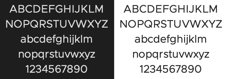
Clarity City is an open source sans-serif typeface. It is the default font for the VMware Clarity Design System.

12


"webfont port of Max Meidinginers Neue Haas Grotesk Pro "

13
14
15
1
Lexend (www.lexend.com)


In 1999, as an educational therapist, Dr. Bonnie Shaver-Troup, working with clients, began observing that reading issues masked the individual’s true capability and intelligence.

In 2000, Bonnie theorized that reading performance would improve through use of:

  • A sans-serif font to reduce cognitive noise -Expanded scaling to improve potential for character recognition -Hyper-expansion of character spacing, which creates a greater lag time and reduces potential crowding and masking effects

These changes led to the development of seven specially-designed fonts, which create an immediate improvement in reading performance.

This is where Lexend was formed.

[Github] https://github.com/googlefonts/lexend

[Website] https://www.lexend.com/

16


Aileron by Sora Sagano

"Aileron is a Neo-Grotesque sans serif super-family of fonts inspired by Helvetica. Compared to Helvetica, it has legibility improvements like curved lowercase l to be easily distinguishable from uppercase I.

Dots and periods are circular and follow Euler spiral, giving a soft appearance. While from a design point of view Aileron is close to Helvetica, conceptually it is closer to Univers."

17
1
submitted 2 years ago* (last edited 2 years ago) by Troll@lemmy.ml to c/open_source_fonts@lemmy.ml


Chivo (‘goat’ in Spanish) is the first Omnibus-Type neo-grotesque typeface family. It has 7 weight variants, plus matching italics. Its solidness and balanced strokes give Chivo both elegance and practicality. Chivo Regular works perfectly in long-reading texts, while Chivo Black is ideal for headlines, banners and highlights. Developed by Héctor Gatti, this is an indispensable ally for any designer.

18
1
submitted 2 years ago* (last edited 2 years ago) by Troll@lemmy.ml to c/open_source_fonts@lemmy.ml


Very nice serif typography, the only problem at the moment is that it doesn't exist in italic... I hope it will come soon.

19
1
submitted 2 years ago* (last edited 2 years ago) by Troll@lemmy.ml to c/open_source_fonts@lemmy.ml


A good free alternative to Trajan. It has no lowercase, but can be used for titling for example.

https://fontlibrary.org/en/font/cinzel

https://github.com/NDISCOVER/Cinzel

20
1
submitted 2 years ago* (last edited 2 years ago) by Troll@lemmy.ml to c/open_source_fonts@lemmy.ml


The SORA typeface was designed to capture SORAMITSU's spirit and heritage and is highly optimized for user interfaces. The outcome is a type family with cues of low-resolution aesthetics and early screen typography but without nostalgia, as every decision was considered towards the crisp digital environment of today. The particularly big x-height combined with evidently generous counters turns the family into a convenient tool for app and web interfaces, where clarity and effectiveness at any size is an imperative. Therefore giving us a neutral, yet distinctive, sans serif typeface with excellent legibility across various mediums.

The SORA typeface is an open-source project and available for download and use following the Open Font License (OFL).

21
22
1
Nimbus Sans L (www.1001fonts.com)


Nimbus Sans L is a version of Nimbus Sans using Adobe font sources. It was designed in 1987. The family includes 17 fonts in 5 weights and 2 widths, with Nimbus Sans L Extra Black only available in condensed roman format.

A subset of Nimbus Sans L, which includes regular and bold weight fonts in all widths and styles, were released under the GPL and AFPL in Type 1 format in 1996 and LPPL in 2009, and is one of several freely licensed fonts offered by URW++.

Although the characters are not exactly the same, Nimbus Sans L has metrics almost identical to Helvetica and Arial. Nimbus Sans L is one of the Ghostscript fonts, a set of free alternatives to the 35 basic PostScript fonts (which include Helvetica).

It is a standard typeface in many GNU/Linux distributions. It was used as default font in OpenOffice.org Calc and Impress in some GNU/Linux distributions (e.g. Ubuntu - up to version 8.10; since Ubuntu 9.04 the default font was changed to Liberation Sans).

23


The package contains the most recent version of the TeX Gyre Termes family of fonts in the PostScript Type 1 and OpenType formats. TeX Gyre Termes is based on the URW Nimbus Roman No9 L kindly released by URW++ Design and Development Inc. under GFL (independently of the GPL release accompanying Ghostscript). The Vietnamese glyphs were added by Han The Thanh.

TeX Gyre Termes can be used as a replacement for the renowned Times (new) Roman font (designed by Stanley Morison together with Starling Burgess and Victor Lardent for the London newspaper “The Times”; it was first issued by the Monotype Corporation in 1932 -- see the article by Charles Bigelow for interesting details: http://www.truetype-typography.com/articles/times.htm).

24


The package contains the most recent version of the TeX Gyre Heros family of fonts in the PostScript Type 1 and OpenType formats. TeX Gyre Heros is based on the URW Nimbus Sans L kindly released by URW++ Design and Development Inc. under GFL (independently of the GPL release accompanying Ghostscript). The Vietnamese glyphs were added by Han The Thanh.

TeX Gyre Heros can be used as a replacement for a popular font Helvetica, also known as Swiss (prepared by Max Miedinger with Eduard Hoffmann, 1957, at the Haas Type Foundry).

25


Palanquin Fonts

Palanquin is a Unicode-compliant Latin and Devanagari text type family designed for the digital age. The Devanagari is monolinear and was designed alongside the sans serif Latin.

Palanquin Dark is the heavier display family, with 4 weights. Palanquin is a text family with seven text weights. The Palanquin superfamily is versatile and strikes a balance between typographic conventions and that bit of sparkle.

Many thanks to Michael for all the technical assistance. Heartfelt thanks to Maggi for the sincere support.

The Palanquin project is led by Pria Ravichandran, a type designer from India. To contribute, see github.com/VanillaandCream/Palanquin

view more: next ›