As this is my first real neography review I thought it made sense to do it on a conlang I know somewhat well at least in terms of community and phonotactics. Much of what I am writing here is my own opinion (it’s an art form, duh) but I hope that I can argue well enough that you’ll agree with me. I’ll go through the features and critique them as I go; as always, the sources are at the bottom of the page.
Consonant Shapes
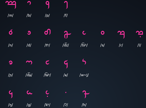
Positives
The inclusion of trailing curves combined with flat stops at the sides of characters makes this script have a truly unique style online and makes things easier when less visible and easier for dyslexics as it is reported that unique additions and features to characters in a font make them more recognisable (1). The dip at the bottom is another feature which can be used to differentiate characters and words and preserves the overall style. The minimalist characters make this script easy and fast to write and don’t involve any hugely complex hand movements.
The design of r and l being similar is good as it makes them easier to learn and more obvious that they are pronounced similarly.
Negatives
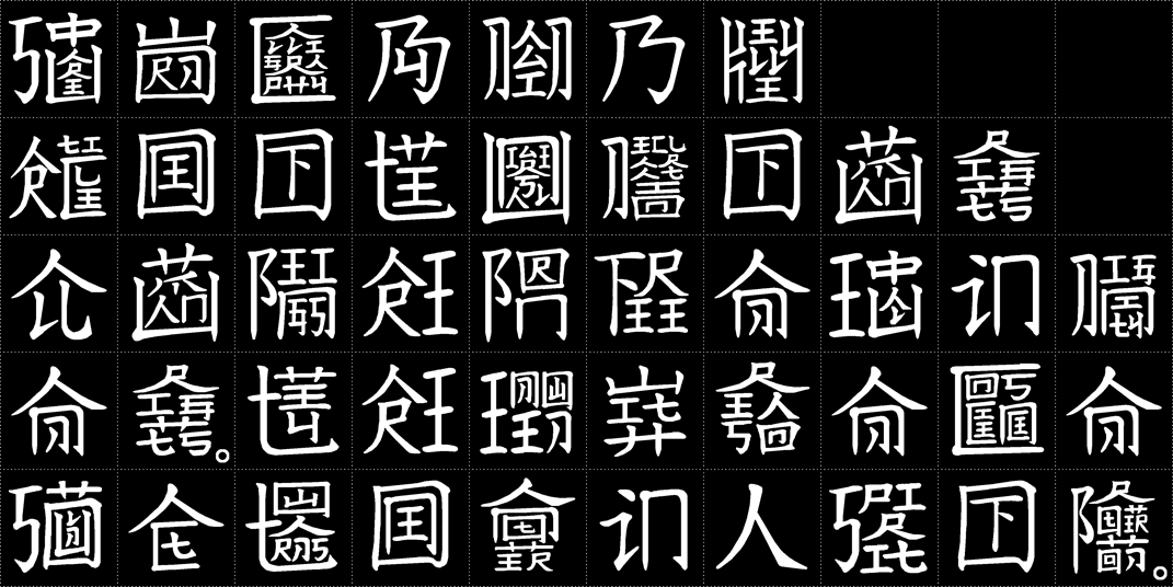
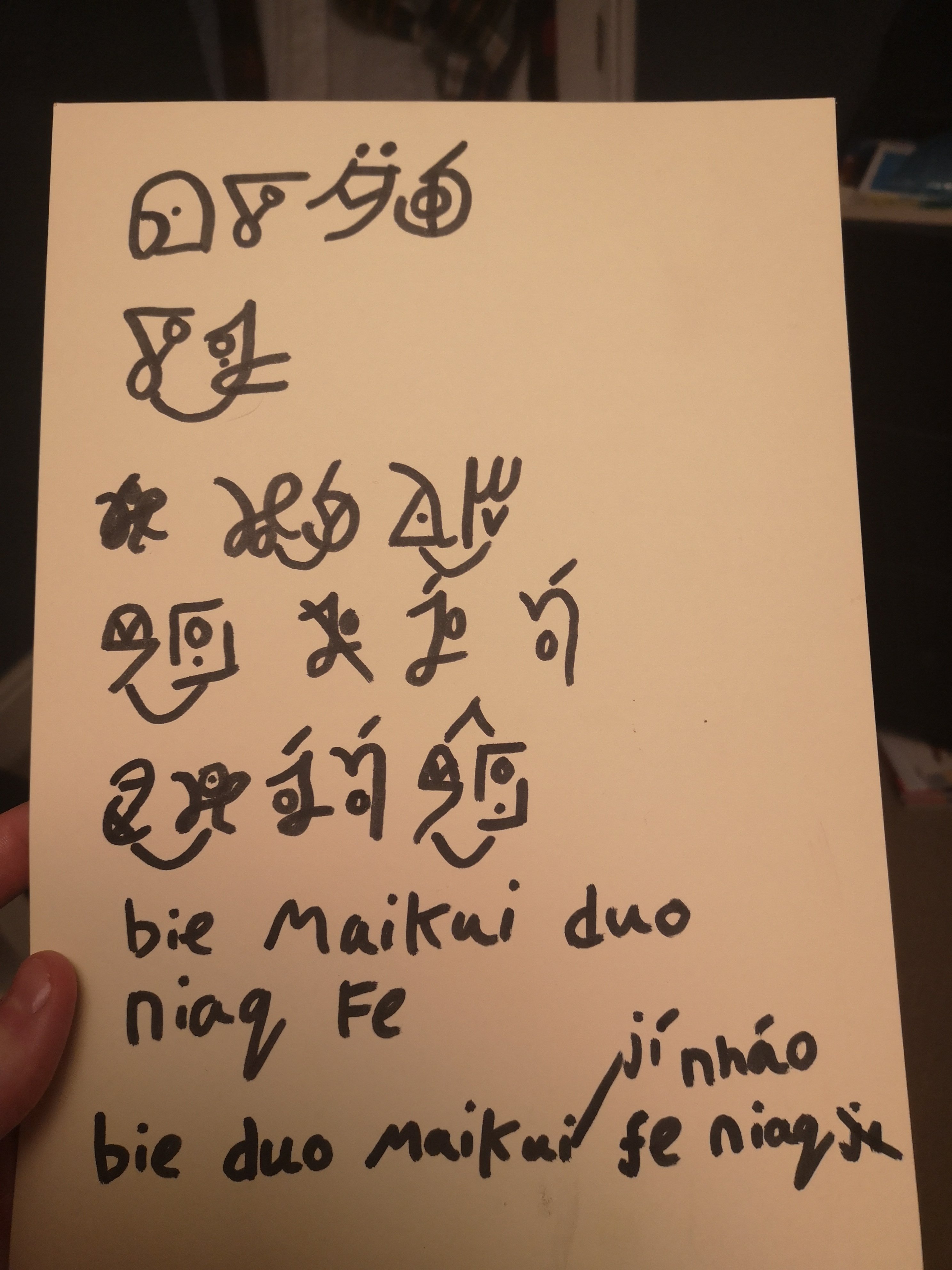
As much as I love this script I believe that many of the letters look far too similar, SH is just CH but with a downstroke which itself is a form of or B C which itself is a dotless form of K, D is a flipped form of G, R is an M missing one circle, N is S missing a flick, and R looks like the inparsable consonant cluster BH (obviously this means you won’t thing it’s another word but reading is about fast recognisability not just mistaken readings).
I think the reason why so many shapes appear the same is because the style forces a narrow set of characters: only downstrokes on the right side of the character, circular motion must be at a set height, two strokes maximum (with two exceptions), the only angles are within a circle/flick or are 90 degrees.
Having a limiting set of rules for neography is a very good idea as it’s what gives Derani such a specific and consistent style but I believe that in this case it leads to missed opportunities and repetition.
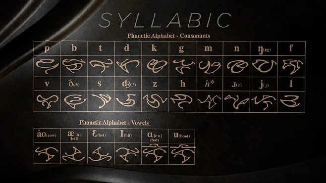
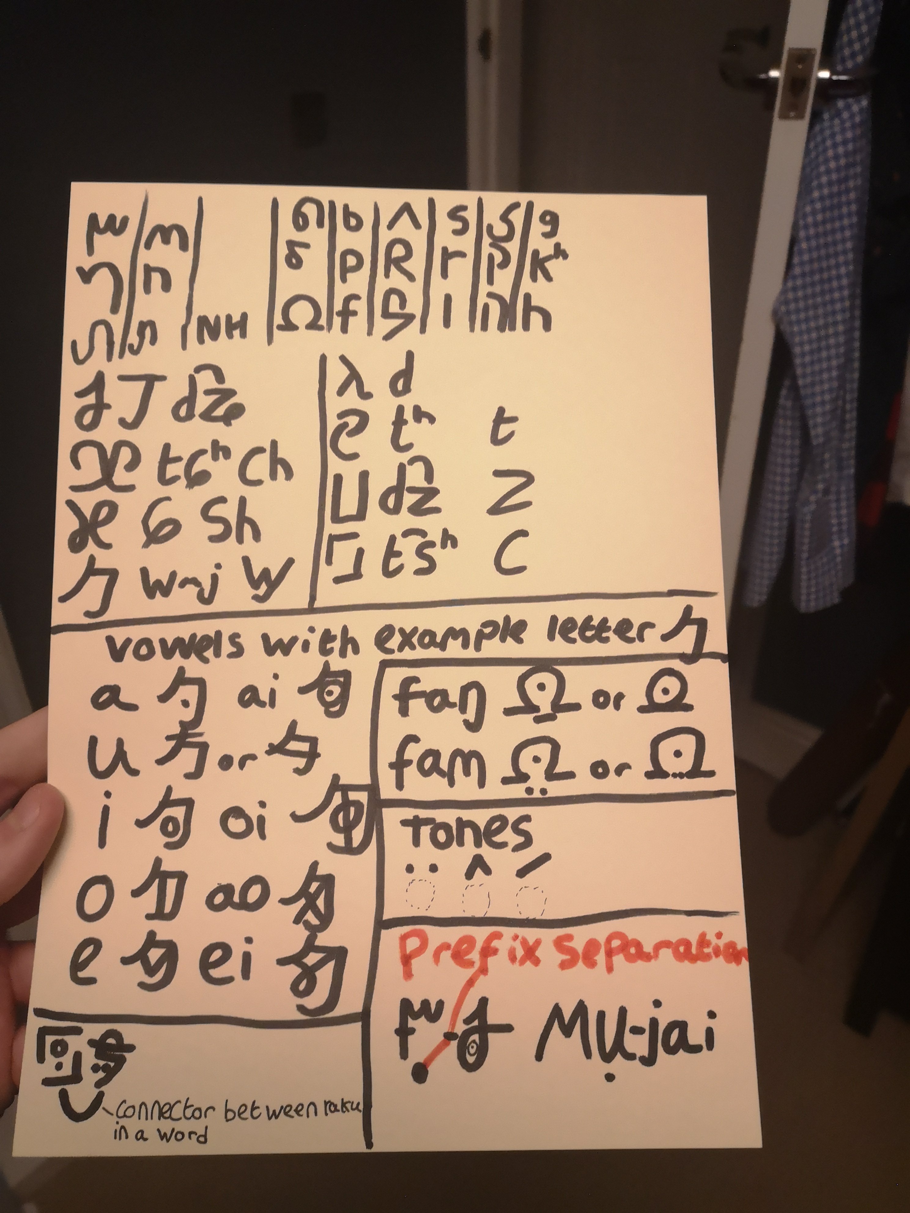
Vowel shapes

These are very similar to the consonants in terms of styling and negatives however there is a flaw which I would say is major: the vowel glyphs are all the same as the consonants. This is referenced on the website and addressed with a pretty good explanation: “The vowels use the same letters as five of the consonants. As consonants and vowels alternate in words, this creates no ambiguities in sequences of CV(Q) syllables.”.
This is a unique way of representing things that could only be done in a language with as restrictive a syllable structure, something Toaq only partially fulfils as the next sentence explains that it does create enough ambiguity to warrant double vowels being marked and marking the start of a vowel onset syllables. I think the point about unambiguous vowels is moot if a new system is needed to make it unambiguous. Once again this could be due to the problem of limitations to the style of individual letters, 5 vowels only adds 100 x 39/34 so 15% (reference number 2) more characters, or perhaps this choice may be made due to learnability but I would consider adequate vowel marking an absolute necessity when it causes bad reading.
Diphthong Marking

Generally a good idea to emphasise diphthongs if there is no specific glyph for them, personally I would have a whole glyph dedicated to them but obviously keeping the number of symbols that need to be memorised low was a clear goal here so this was good design.
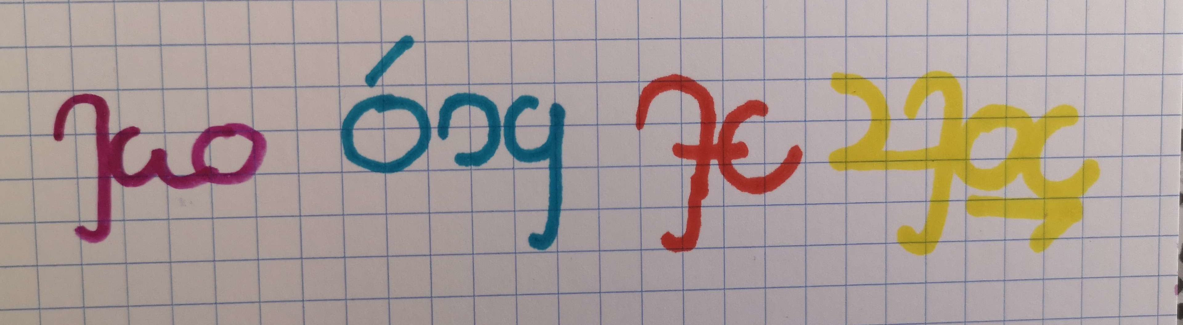
Special symbols

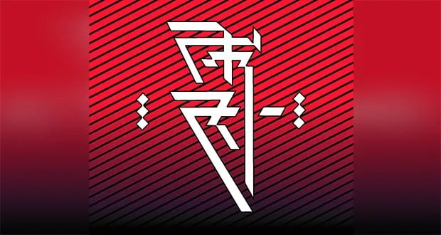
This is a nice looking symbol and makes names obvious.

This is good in terms of design as it creates blank space at the normal viewing height for characters while being long and spikey to create contrast. Unfortunately this is a 5 stroke symbol which is a lot for something that will be used fairly often, another shape which requires much less time and takes up slightly less space would be perfec tbut I think this glyph is almost okay.

This glyph is good as it creates vertical visual contrast rather than horizontal meaning it shows a break in the sentence but also doesn’t look anything like the subordination mark. I really like the look of this character as it reminds me of the ithkuil 3 script which I am very fond of.

I think the design of this was meant to reflect the fact that it’s somewhere in the middle of the interrogative and declarative which is clever however the contrast isn’t really seen from afar and there could be much more visually distinct characters which still form a middle point like this.

This is too similar to the declarative end.
Variable marks
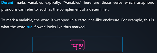
This is a very creative way of showing the grammar of Toaq and should be greatly appreciated. Unfortunately this often makes an unfilled space above a word, I’m sure there’s a clever way of making tone work with this system but as for now I believe it’s worth it.
Overall I believe this script deserves a lot of love for it’s wonderful style, usability online and integration with Toaq’s grammar. Derani has come a long way and still has a long way to go, so show it some love!
1 https://www.dyslexiefont.com/en/dyslexiafont/
all points except 2 and 5 reference this
2 21 consonant marks + 3 tone marks + a diphthong mark + a hiatus mark + the prefix mark + 5 grammar marks +2 variable marks
3 https://toaq.net/refgram/orthography/
Accessed on 26/07/2023


 I think the creation of this system goes to show that there is more to a writing system than just conveying information, the glyphs you choose, the style they're in and the way they combine are important factors in making a good script.