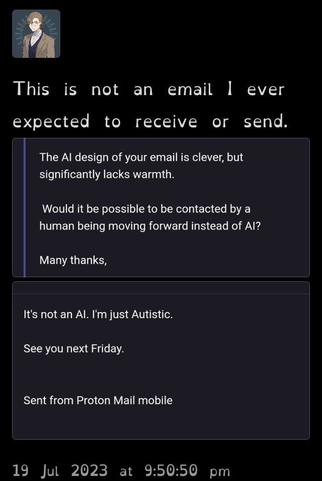
I monitor the main email account where I work and we once got an email complimenting us about how helpful our AI web chat support was.
Our web chat support is all humans.
Posts of people not realising the person they’re talking to, is the person they’re talking about.
Acceptable examples include:
Discussions on any topic are encouraged but arguements are not welcome in this community. Participate in good faith - don’t be aggressive and don’t argue for arguments sake.
The posts here are not original content, the poster is not OP and doesn’t necessarily agree with or condone the views in the post. The poster is not looking to argue with you about the content in the post.
Rules:
This community follows the rules of the lemmy.world instance and the lemmy.org code of conduct. I’ve summarised them here:
Please report comments that break site or community rules to the mods. If you break the rules you’ll receive one warning before being banned from this community.
PLEASE READ LEMMY.ORG’S CITIZEN CODE OF CONDUCT: https://join-lemmy.org/docs/code_of_conduct.html
PLEASE READ LEMMY.WORLD’S CODE OF CONDUCT: https://lemmy.world/legal
I monitor the main email account where I work and we once got an email complimenting us about how helpful our AI web chat support was.
Our web chat support is all humans.
This is not a font I ever expected to read or see
That’s ”open dyslexic”. As far as I’m aware, it’s a font specifically designed to be easily readable by dyslexic people
I didn't know that, thanks
I’m not dyslexic but I have macular issues which make reading a bit difficult. Switching to the open dyslexic font on my kindle has been a game changer.
It can even help with attention-focussing issues like in ADHD. Marvelous invention, really.
Ironically i find it vastly more difficult to focus on than normal fonts, all i want is to FUCKING MAKE GLYPHS LOOK DIFFERENT TO EACH OTHER
iIlL| if these don't look OBVIOUSLY different in a font it is a bad font and must die.

Those look very different from each other to me.
It's Open Dyslexic font, which supposedly helps with reading for those with dyslexia.
Interesting. Was about to complain about those stupid quirky fonts people use.
This font is an abomination worse than Comic Sans.
Is it possible they think "Proton Mail" is some robot thing?
Good point. It’s definitely what I’d claim if I was the guy who replied!
I highly recommend the paid upgrade for proton. You get so much for it and they upgrade your cloud storage 1TB each year. Also, Naomi Brockell has done great advice for setups.