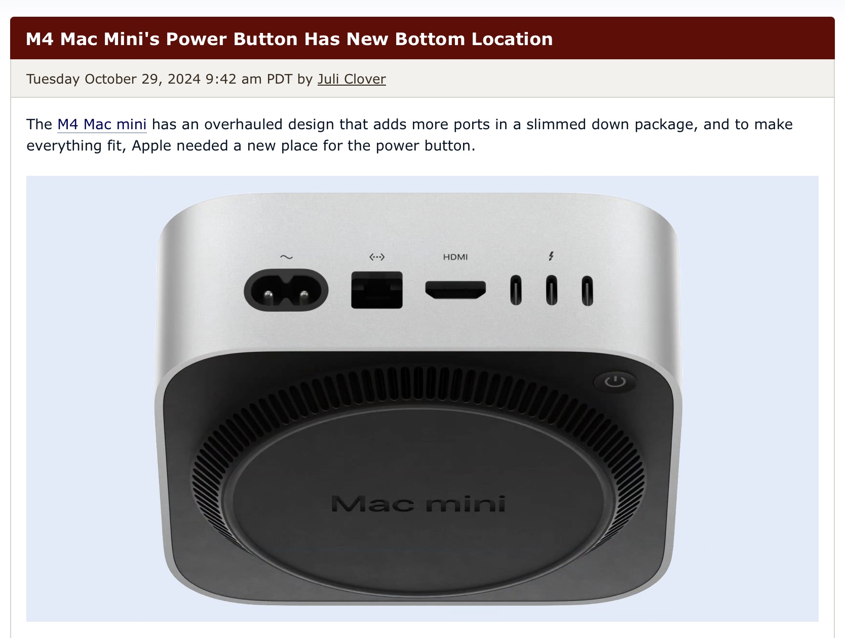
On the bottom, in the back...
Technology
This is a most excellent place for technology news and articles.
Our Rules
- Follow the lemmy.world rules.
- Only tech related content.
- Be excellent to each another!
- Mod approved content bots can post up to 10 articles per day.
- Threads asking for personal tech support may be deleted.
- Politics threads may be removed.
- No memes allowed as posts, OK to post as comments.
- Only approved bots from the list below, to ask if your bot can be added please contact us.
- Check for duplicates before posting, duplicates may be removed
Approved Bots
As long as your default mode is sleep it'd be ok. I touch my PCs power button only when it crashes so horribly that a forced shutdown is the only way out...
Oh no, I'll have to slightly lift a tiny box on my desk several times a year!
Unless your computer has issues, can’t you just power off from within macOS?
Here we go again making mountains out of mole hills for Apple.
I am all for calling out Apple for their treatment of workers in ASIA, or their wealth, heck even the closed garden, but this… nah fam I don’t care where the button is.
I really hope this is one of those tactile hit it from the top and it'll trigger from the bottom designs. But more likely they just never expect you to use it.
Hahaha I thought this was the onion and the button was the big fugly thing that covers the whole bottom
