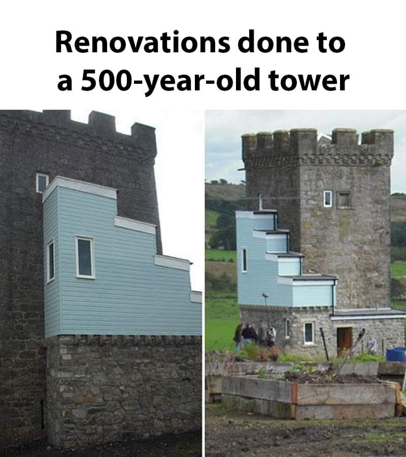
Everytime I start to really disagree with things like heritage zoning I see something like this.
Terrible photos listed by estate agents/realtors that are so bad they’re funny.
Posting guidelines.
Posts in this community must be of property (inside or out) listed for sale which contains a terrible element. “Terrible” can refer to:
the photo itself (finger over the lens, too far away, people in the shot, bad Photoshop, etc.)
the property (weird layout, questionable plumbing, unsound structure, etc.)
the interior (carpeted bathrooms, awful taste interiors, weird mannequins/taxidermies/art, inflatable pools indoors, etc.)
the actual listing itself including unusual descriptions and unrealistic pricing. However, this isn’t a community to discuss the housing market in general. This is a comedic community - let’s keep it light.
Photos can be sourced from anywhere and be any age, but please check they haven’t already been posted.
Censor any names/contact details of private individuals.
Mark the post NSFW if it includes nudity or sensitive content
Rules.
This community follows the rules of the feddit.uk instance and the lemmy.org code of conduct. I’ve summarised them here:
Everytime I start to really disagree with things like heritage zoning I see something like this.
This has been floating around the internet for some time.
The funny part is that heritage zoning is the reason the addition looks the way it does. The upper floor was inaccessible and stairs needed to be added. Local regulations state that any additions must be visually distinct from the original structure so this monstrosity was the result.
Look up Caldwell Tower in Scotland for more information.
Why the fuck would additions need to be visually distinct?
Here is the episode of The Restoration Man that documented the project - they go into the planning side of this in-depth because it's really a head-scratcher. The owner tried many times to get planning for more subtle alternations but they kept getting knocked back because it has to be distinctive enough that it's clear what is the old building and what are the new additions. What you see is the result of that messy process.
That's dumb as fuck, literally even if it was brick you'd be able to tell from the weathering of the original stone. NIMBYs are fucking idiots.
if it's so important that we must be able to tell when it was built, just fucking carve the date into each brick lmao
Maybe to not be misleading about what is original and what is new
I cant understand why that would be a bad thing
Maybe, in case the next renovation is due, you know for sure which parts are to be preserved and which can be removed. However, some craftsman or architect doing that should be able to tell the difference between modern boards and windows and ancient ones without relying on the help of white plastics or baby blue paint.
I think you could tell when it goes from stone to plastic.
I work in stone conservation and for the body that dictates these regulations, even if it was built out of stone it would be required to be visually distinct. The only exception is if it were reinstatement of an original feature that had been demolished or decayed to the point that it had to be removed and fully rebuilt. In that case every effort should be made to source the stone from the same quarry, and the same mortar mix should be used.
Why on earth white plastic windows and baby blue paint?
Budgeting? White PVC windows are cheapest, you pay extra for colors.
I know.
However, if you own a cultural heritage building, the c.h. office has a lot of saying about each and every modification done, especially on the outside, so I doubt it's due to financial issues.
Looks like something from Monty Python and Holy Grail
I remember when this hit the news and do hope it's been redone since.
edit: no updates on the Scottish Castle Association since 2012 and TripAdvisor photos show it unchanged other than some weathering.
edit2: Here is the episode of The Restoration Man that focused on the tower and it explains the planning process that led to this monstrosity.
It would have been nice if they pointed out which part was renovated so I didn't need to scour the picture to find it.
Sorry, I will write a detailed alt next time
I need a useless red circle to find it
Gentrification is getting out of hand.
Where the President of the HOA lives
UK server, OK. Fine. But OP has never been to Pennsylvania in the US. Most houses over a hundred years old look like this: you can see the generations that have lived in it. First it's stone and mortar; then there's a wood addition ca. the early 1900s; then there's a more modern addition ca. the 50's or later. There's one property that was briefly famous as it came up in Zillow that had 5 clearly distinctive styles and technologies worth of additions on it; it's like every generation added another room with whatever was in style at the time. I can't find a picture, but it was hideous.
I don't know if it's common all along the mid-Atlantic, but it is super common in Pennsylvania.
Everyone laughing at the repairs to your tower until the Mongol hordes return - and theirs still aren’t done because they were waiting to source the right Welsh stone.
People are such perfectionists when it comes to buildings. I love this image; the patchwork aesthetic needs less hate. Yeah it looks silly, but why should it look serious? I wouldn't be upset if a building built today were to have an awkward attachment added in 500 years that was built to the design standards of that time period.
Somebody showed me recently the rebuild of the Augusteum building of the University of Leipzig which had a hyper-modern redesign like 180 years after it was first built (look it up, it's pretty cool). And the building in this post is like a lower-effort, more earnest version of that idea. Is it bad real estate? Sure. But it's good architecture. "Authenticity" be damned.
This comment made me partially re-evaluate my opinion of this building
I don't hate it.
Well maybe you should
No worries, I hate it enough for both
only plus I can see is that the renovation is visibly distinguishable – they’re not trying to pass it off as a “restoration” …
Another comment ITT claims that that's exactly why they did it this way-- Regulations say it must have that property.
Looks weird, but if they added a 3rd aesthetic, like Japanese wooden housing, or Russian brutalism, then we'd be talking.