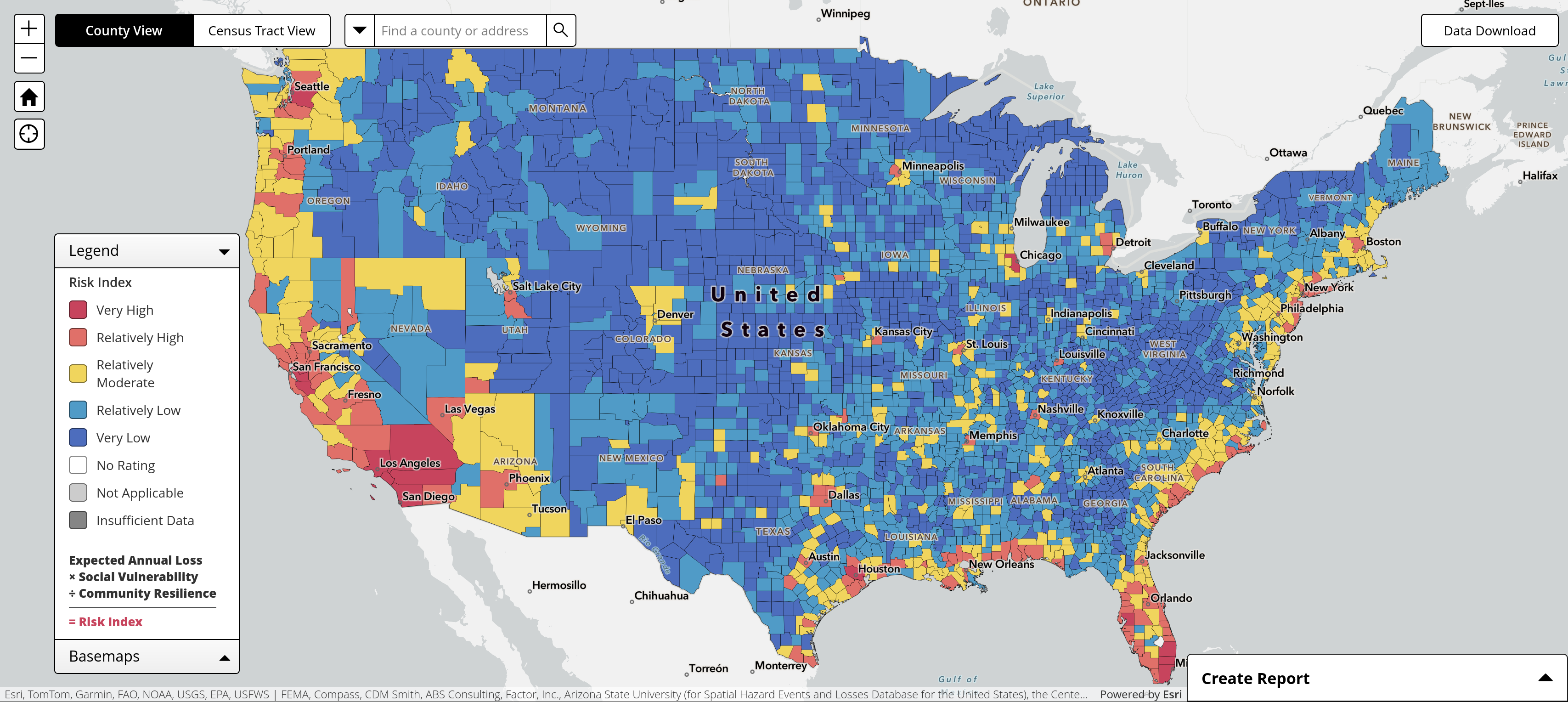
FEMA Natural Hazards Risk Index
@map_enthusiasts
Source: https://hazards.fema.gov/nri/map
#maps
For the map enthused!
Rules:
post relevant content: interesting, informative, and/or pretty maps
be nice
FEMA Natural Hazards Risk Index
@map_enthusiasts
Source: https://hazards.fema.gov/nri/map
#maps
This looks suspiciously like a population density map.
Apparently the calculation includes "Social Vulnerability", which looks very much like a population map. Which is probably why my city is yellow due to winter weather even though the surrounding counties are blue.
Buffalo, eh?