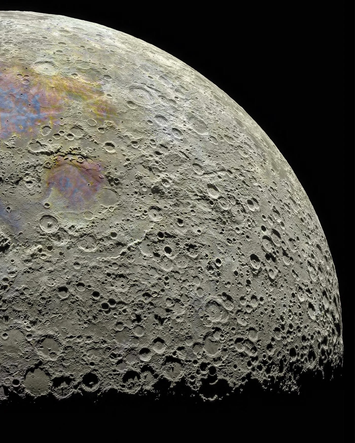
this post was submitted on 23 Jun 2024
12 points (100.0% liked)

Astronomy

3862 readers
1 users here now

founded 2 years ago
MODERATORS
you are viewing a single comment's thread
view the rest of the comments
[โ€“] foofiepie@lemmy.world 1 points 2 months ago (1 children)

Pasted from the Reddit thread:

The colors don't match what a human eye would see, but without going into a philosophy tangent, color is extremely complex and a huge part of what a human sees is your brain doing representations and mapping that isn't perfectly represented in the physical object being observed. In this photo the saturation has been increased (versus a human eye) because it helps show the geological differences on the lunar surface. The reddish areas are high in iron and feldspar, and the blue-tinted zones have higher titanium content. Instead of thinking of the color as "real" or "fake" it's probably better to think of it as a tool, to simulate if you were a super human with the ability to adjust saturation and detect metal composition with your eye. Usually when a photo like this is shared by researchers and scientist all this nuance and exposition is included, but then journalist and social media get a hold of it and people start crying "fake" without an understanding of what the image is trying to accomplish. TL;DR - The image isn't what a human eye would see but it isn't just art to look cool, the color and modifications have physical meaning and serve a purpose.

[โ€“] StaySquared@lemmy.world 0 points 2 months ago

Excellent explanation. Appreciate you sharing it!