this post was submitted on 01 Nov 2024
292 points (98.3% liked)
Data Is Beautiful
6900 readers
1 users here now
A place to share and discuss data visualizations. #dataviz
(under new moderation as of 2024-01, please let me know if there are any changes you want to see!)
founded 3 years ago
MODERATORS
you are viewing a single comment's thread
view the rest of the comments
view the rest of the comments


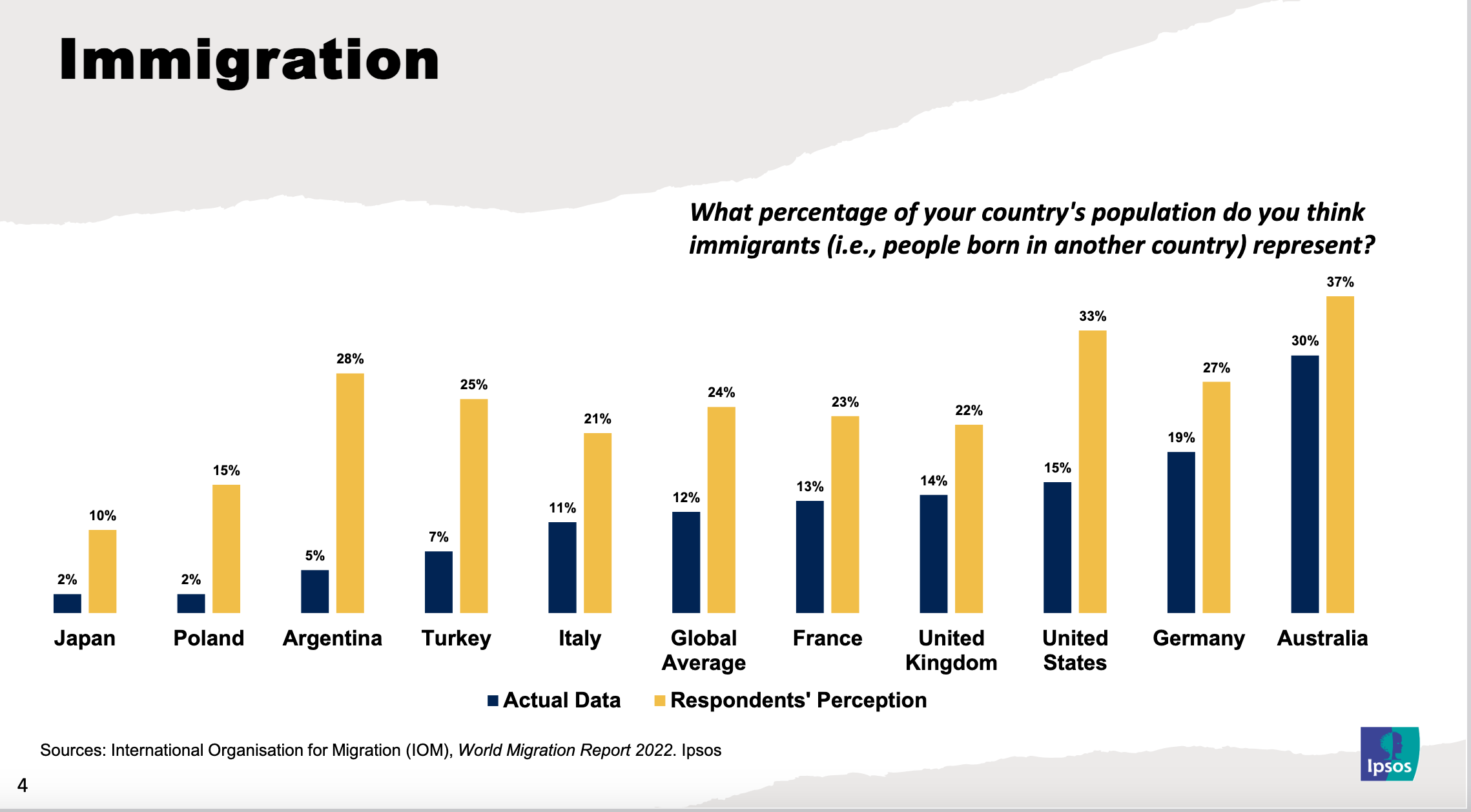
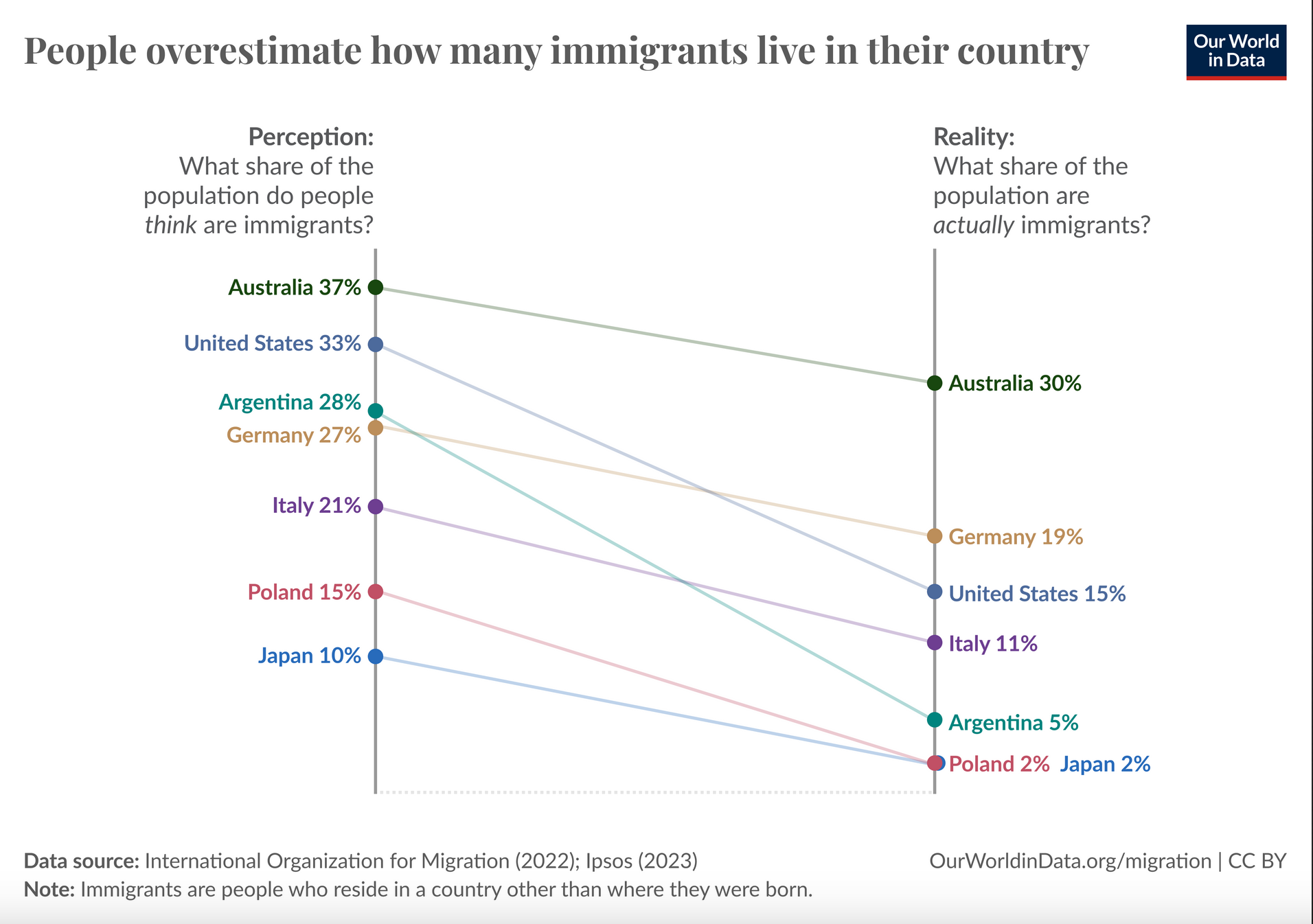
Oh yes absolutely, people would definitely just "eyeball" their estimate and the percentages we see in the graphs are population (well, sample) level averages, but I'd still say that the differences between these average estimates and actual reality are by and large much worse that "on the money". To illustrate, if the estimate for some country was eg. 30% and the real proportion 40%, the relative error – off by a factor of 1.33 – would be smaller than if the estimate is 12% and the real value 2% – off by a factor of 6 – even though both have a 10 point error.
So eg Poles' and Argentinians' estimates are both 12 percentage points off, but because Poland's immigrant population is smaller that means that they overestimated its real size by 650% and so their estimate was 7.5x higher, but Argentinians were "only" off by 460% / 5.6x. 'Strayans were off by 7 points, but their relative error was only around 23%, which is still almost a 1/4 error and their estimate looks like it was the best out of these. The average global error was 100%, so on average people think there's 2x as many immigrants as there actually are, and characterizing that as "pretty much on the money" is, well, maybe a bit generous