this post was submitted on 22 Oct 2024
359 points (98.4% liked)
Source Memes
953 readers
1 users here now
Community for memes about the goldsrc/source engine and Valve games.
founded 1 year ago
MODERATORS
you are viewing a single comment's thread
view the rest of the comments
view the rest of the comments

Ok.
I mean, this isn't the direction I'd go with this space, but that's what I'd suggest working with what you have.
Kill that overhead. Please.
As an electrician:
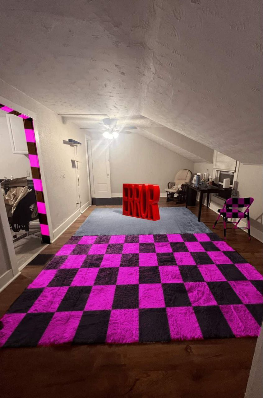
I'd put some sconces on the tall wall. Something simple and tasteful. And ideally some recessed can lights in the angled ceiling, maybe with a gimbal so you can adjust the angle of the light.
The fact that the checker pattern on the doorway doesn't continue around the rest of the trim really bugs the snot out of me. Please carry that all the way around. Ideally, do all the trim that way, since it's all the same "texture". And yeah the carpet/rug all needs to match or go, no half measures.
100% agreed on the ceiling fixture. In that small a space, I'd take it all the way out. If you need a fan there for airflow, there are good low-profile options out there. Ideally I'd do away with it altogether, though, and see about possibly adding a mini-split if it's too uncomfortable in the summer/winter.
If I think of anything else I'll edit. It's a fun room, I'd love to steal the idea for a game room some day. But this implementation needs a touch more work.
E: yknow, some floor cushions and a low coffee table might be nice there by the window instead of the hobo batchelor setup. It'll make it seem taller, too.
That is a better suggestion than my rope lighting. Of course, It'd require a licensed electrician to do... looks suspiciously
Another excellent suggestion, but this:
is the best idea. There are some really nice, attractive in-wall options that would do a better job than a ceiling fan, with more versatility.
floor cushions and a low coffee table might be nice there by the window instead of the hobo batchelor setup
This is the best idea of all. Full carpet, low chairs or beanbags, and a really low coffee table; this would be a completely different room!
I disagree with your point 1 a little bit. If the goal is to make the room look airier (or not compressed) I would get rid of the texture on the ceiling, but keep it white. A ceiling with a darker color than the walls will look smaller.
If OP wants more color, they should add some art to the wall, or paint the walls and have the ceiling match or be lighter/white.
The rest I agree with though.