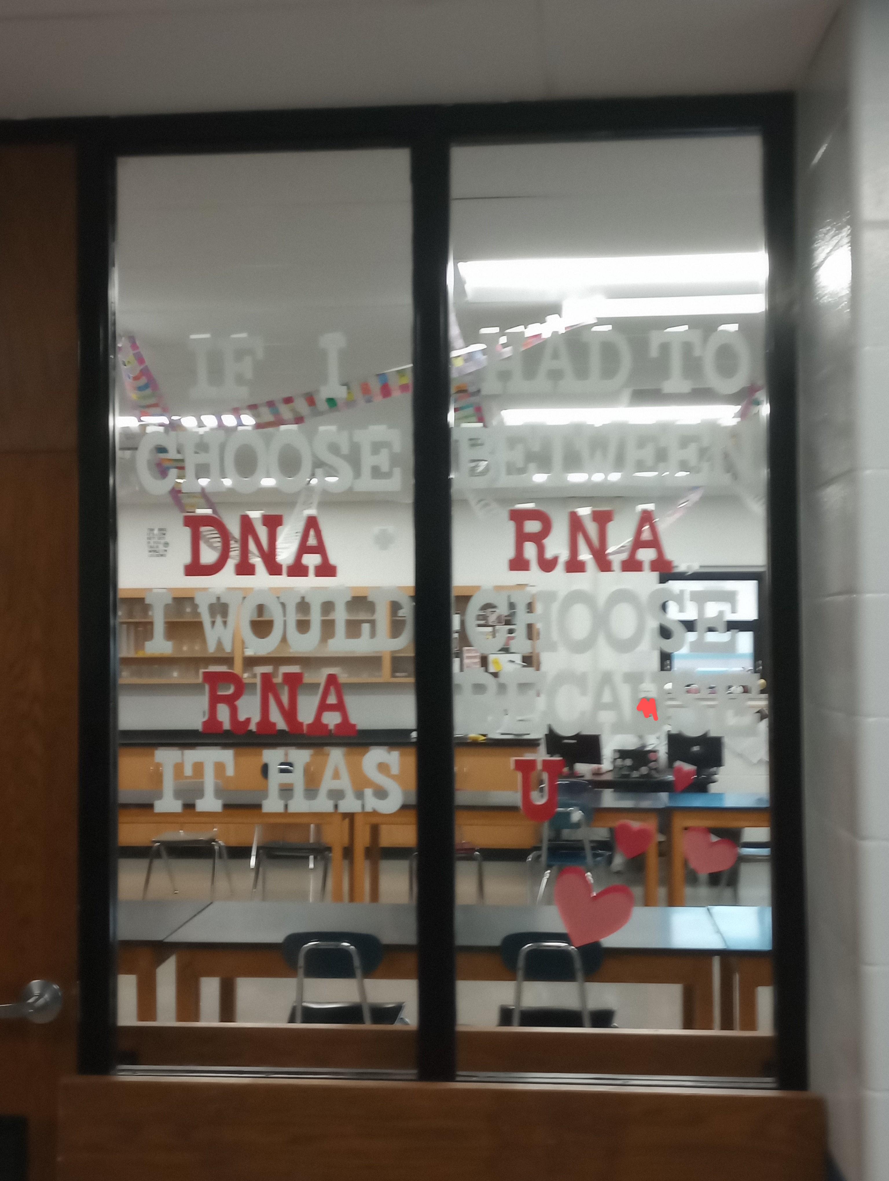
this post was submitted on 30 Sep 2024
94 points (94.3% liked)
NoSafetySmokingFirst
475 readers
133 users here now
Welcome to NoSafetySmokingFirst!
For images where the text reads correctly left to right, but visual cues (like colouration, vertical proximity, or horizontal separation) lead you to try to read it top to bottom.
This is similar to, but distinct from, the more widely known “DontDeadOpenInside” format. In that case, the text reads correctly top to bottom, but visual cues (like colouration, horizontal proximity, or vertical separation) lead you to try to read it left to right.
The post that started it all:
Other related communities:
- !dontdeadopeninside@lemmy.ohaa.xyz
- !yelldowlgyel@sopuli.xyz (letters arranged in any confusing order)
founded 2 months ago
MODERATORS
you are viewing a single comment's thread
view the rest of the comments
view the rest of the comments

Consistently upside-down serif 𝐍s. Ewww...
This is very common. These two buildings have 𝗡 and 𝗭 swapped (and an upside-down 𝗦):


Other sins include horizontally or vertically flipped serif 𝐀𝐁𝐔𝐕𝐖 if that can happen. Every alphabet manufacturer should put a small "TOP - Remove after installation" sticker at the front top of each letter, or at least indicate the direction on the packaging.