this post was submitted on 03 Jul 2024
886 points (94.7% liked)
Science Memes
11217 readers
2200 users here now
Welcome to c/science_memes @ Mander.xyz!
A place for majestic STEMLORD peacocking, as well as memes about the realities of working in a lab.

Rules
- Don't throw mud. Behave like an intellectual and remember the human.
- Keep it rooted (on topic).
- No spam.
- Infographics welcome, get schooled.
This is a science community. We use the Dawkins definition of meme.
Research Committee
Other Mander Communities
Science and Research
Biology and Life Sciences
- !abiogenesis@mander.xyz
- !animal-behavior@mander.xyz
- !anthropology@mander.xyz
- !arachnology@mander.xyz
- !balconygardening@slrpnk.net
- !biodiversity@mander.xyz
- !biology@mander.xyz
- !biophysics@mander.xyz
- !botany@mander.xyz
- !ecology@mander.xyz
- !entomology@mander.xyz
- !fermentation@mander.xyz
- !herpetology@mander.xyz
- !houseplants@mander.xyz
- !medicine@mander.xyz
- !microscopy@mander.xyz
- !mycology@mander.xyz
- !nudibranchs@mander.xyz
- !nutrition@mander.xyz
- !palaeoecology@mander.xyz
- !palaeontology@mander.xyz
- !photosynthesis@mander.xyz
- !plantid@mander.xyz
- !plants@mander.xyz
- !reptiles and amphibians@mander.xyz
Physical Sciences
- !astronomy@mander.xyz
- !chemistry@mander.xyz
- !earthscience@mander.xyz
- !geography@mander.xyz
- !geospatial@mander.xyz
- !nuclear@mander.xyz
- !physics@mander.xyz
- !quantum-computing@mander.xyz
- !spectroscopy@mander.xyz
Humanities and Social Sciences
Practical and Applied Sciences
- !exercise-and sports-science@mander.xyz
- !gardening@mander.xyz
- !self sufficiency@mander.xyz
- !soilscience@slrpnk.net
- !terrariums@mander.xyz
- !timelapse@mander.xyz
Memes
Miscellaneous
founded 2 years ago
MODERATORS
you are viewing a single comment's thread
view the rest of the comments
view the rest of the comments

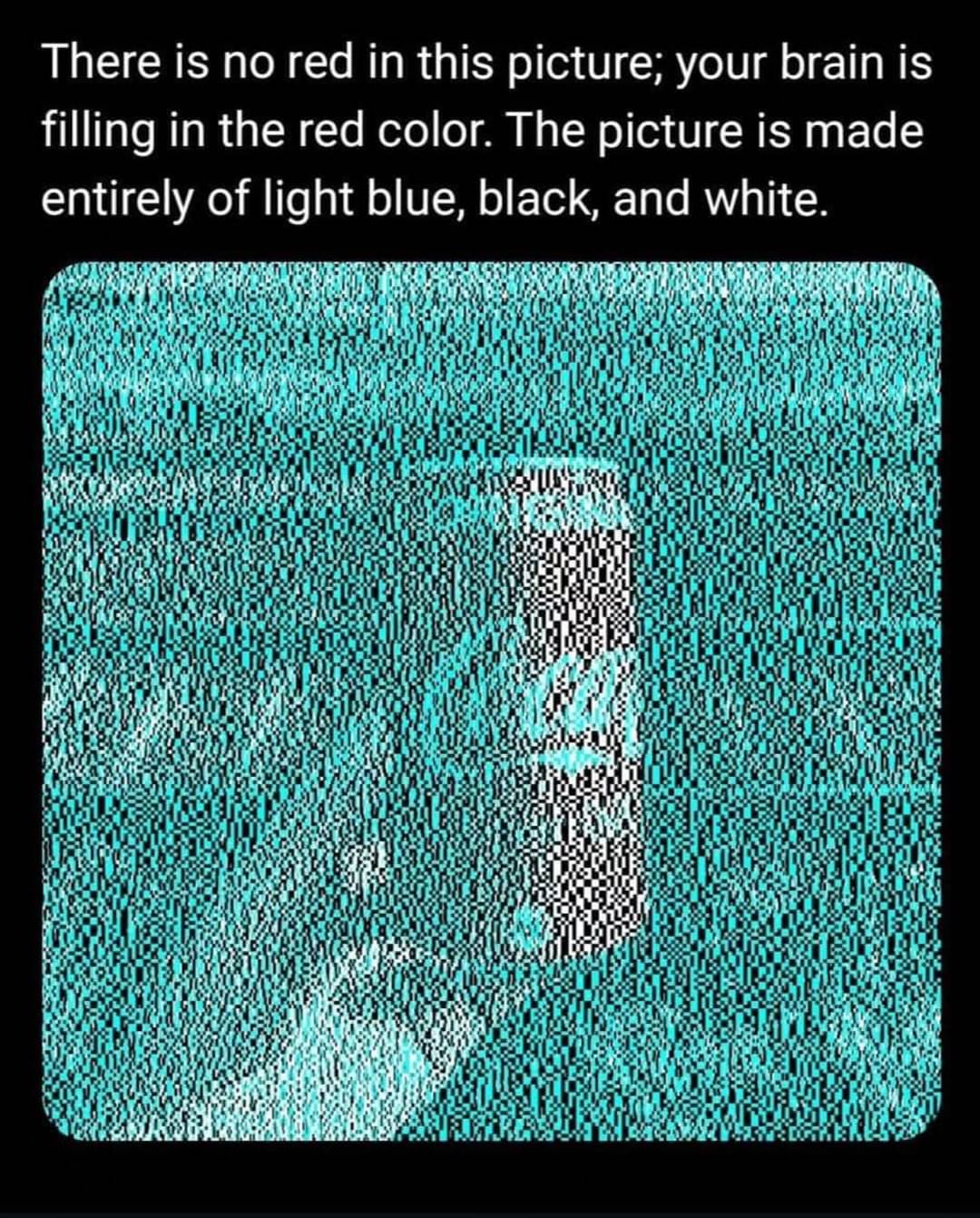
Oh weird, I assume this is just because the white is relatively red compared to the cyan, right? As in if you took any image and coloured it in the same way then it would also look red.
Yeah, there seems to be a lot more going on here than just marketing. If you mask the logo, the red still works. I believe it has to do with the combinations of white/black, white/cyan, black/cyan and the relative size of the blocks to produce a red hue through complimentary color persistence or whatever it's called.
Hand doesn't look red tho
Brain uses expectations to decide what to fill perception with. you don't expect hands to be the same red tone as cola cans.
I think it's also the amount of blue overlay. If you zoom way in, the cola can has much larger chunks of uninterrupted white, whereas the hand has a lot more blue interspersed.
Fair point, well observed!