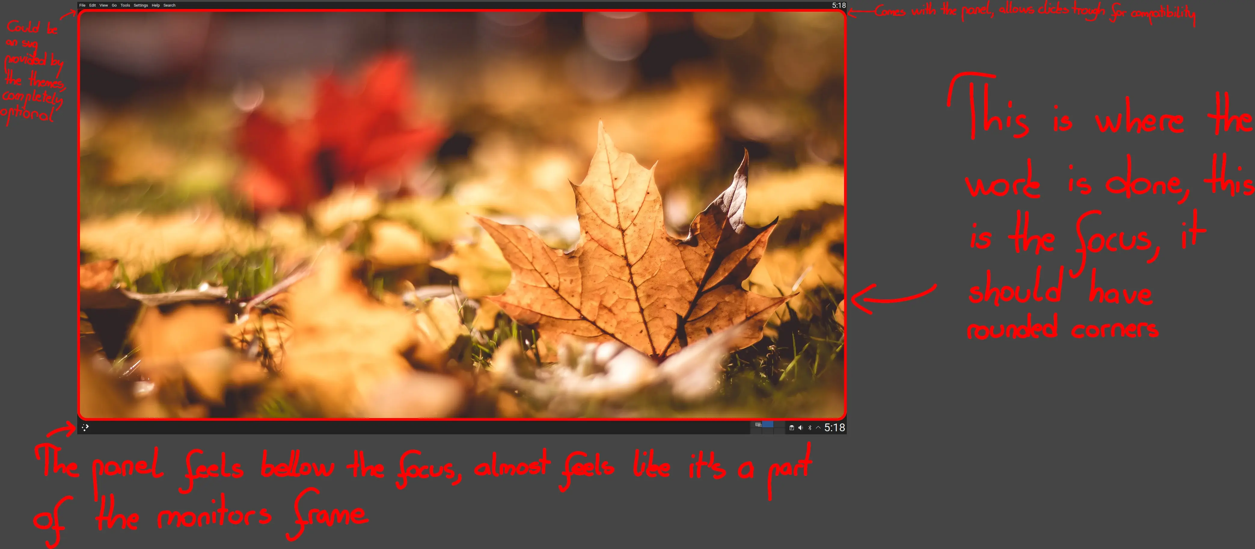
Plasma 6 has introduced rounded corners for the panels. I have a similiar idea, basically the same but in a very different way.
Rounded corners for the desktop. Instead of rounding the corners of the panel, there could be an option to round the corners of the desktop. The panel here is viewed as a background object, and the focused object that pops out is the desktop, which is a rectangle, with sharp uncomfortable edges at the moment.
This could be a new and unique way of viewing the desktop, and we could be once again be one step ahead of the windows designers if the rumours about windows 12 are true. There are 1 or 2 third party little projects already trying to achieve this or a similiar effect, but there aren't any major implementations.
Achieveing this effect could be best done in my opinion with an extra included svg with plasma themes, because this does not fit all styles, and the user should also be able to turn it of, because some might find this annoying. The effect should be turned on only for the corners that have panels touching them, and in fullscreen, it should hide with the panel.
The program I'm using to achieve this effect has the problem of it not allowing clicks trough even in the transparent area, but this has only caused one button to be slightly harder to be clicked in one application, and that is gimp if it's maximized(not full screen) and has the smallest icons enabled, so if it doesn't cut too big of a portion off the screen, all programs could run perfectly fine without any modification.
This could be a very good thing for thememakers, and it can be done with very little code and almost no bugtesting, and no compromises.

I just want to use 100% of the space on my screen. No gaps please. Screw round corners. Give me full square windows and panels like Windows 10.