this post was submitted on 28 Aug 2024
84 points (92.9% liked)
Data Is Beautiful
6968 readers
7 users here now
A place to share and discuss data visualizations. #dataviz
(under new moderation as of 2024-01, please let me know if there are any changes you want to see!)
founded 3 years ago
MODERATORS
you are viewing a single comment's thread
view the rest of the comments
view the rest of the comments

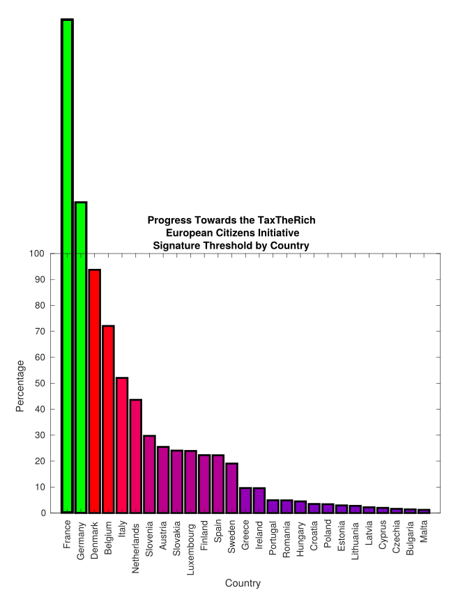
How do Germany and France have a greater than 100% participation rate?
Edit: oh that just means they're above the required threshold already.
Thanks for the clarification. I needed that.
Yes, this graph is not clearly presented. It is not really beautiful.
The data it presents is kind of good, but the main message should be here to spread awareness and get more people to participate in that petition.
a rare case in which >100% is possible