this post was submitted on 18 Aug 2024
1496 points (99.1% liked)
Technology
59578 readers
2857 users here now
This is a most excellent place for technology news and articles.
Our Rules
- Follow the lemmy.world rules.
- Only tech related content.
- Be excellent to each another!
- Mod approved content bots can post up to 10 articles per day.
- Threads asking for personal tech support may be deleted.
- Politics threads may be removed.
- No memes allowed as posts, OK to post as comments.
- Only approved bots from the list below, to ask if your bot can be added please contact us.
- Check for duplicates before posting, duplicates may be removed
Approved Bots
founded 1 year ago
MODERATORS
you are viewing a single comment's thread
view the rest of the comments
view the rest of the comments

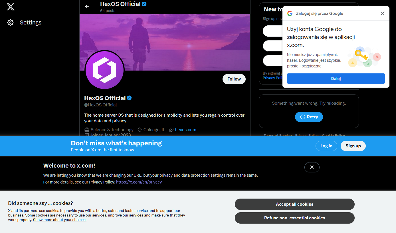
This is so common it has a name, it’s called banner blindness.
One of the important aspects of interface design is supposed to be not showing alerts for everything, so that when they pop up you feel compelled to pay attention.
Not long ago a nurse killed an older woman by giving her the wrong medicine; she took accountability but called out that the software they use provides so many alerts that (probably unofficial) policy was to just click through them to get to treating the patient. One of those alerts was a callout that the wrong dosage was selected and she zoomed right by it out of habit.
Another term I seen in the context of healthcare is alert fatigue:
https://en.wikipedia.org/wiki/Alarm_fatigue
Automation engineer here: alarm management is a hugely important part of making a plant operable.
It is also a project that is never done, you must always review alarms that come in and see if they are providing useful information and what the operators are supposed to do with said information.
If the operators are not supposed to do anything with the information, then what is the point of having the alarm?
Same when setting up Nagios, after a time you learn fewer alerts is better