492
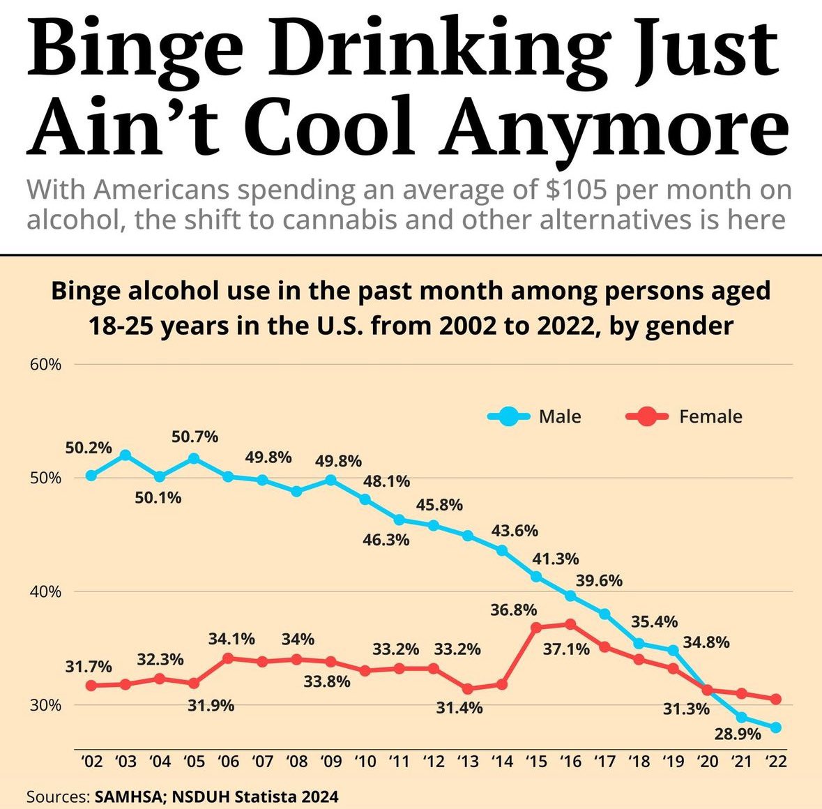
Binge alcohol use in the past month among persons aged 18-25 years in the U.S. from 2002 to 2022, by gender
(lemmy.world)
A place to share and discuss visual representations of data: Graphs, charts, maps, etc.
DataIsBeautiful is for visualizations that effectively convey information. Aesthetics are an important part of information visualization, but pretty pictures are not the sole aim of this subreddit.
A place to share and discuss visual representations of data: Graphs, charts, maps, etc.
  A post must be (or contain) a qualifying data visualization.

  Directly link to the original source article of the visualization
    Original source article doesn't mean the original source image. Link to the full page of the source article as a link-type submission.
    If you made the visualization yourself, tag it as [OC]

  [OC] posts must state the data source(s) and tool(s) used in the first top-level comment on their submission.

  DO NOT claim "[OC]" for diagrams that are not yours.

  All diagrams must have at least one computer generated element.

  No reposts of popular posts within 1 month.

  Post titles must describe the data plainly without using sensationalized headlines. Clickbait posts will be removed.

  Posts involving American Politics, or contentious topics in American media, are permissible only on Thursdays (ET).

  Posts involving Personal Data are permissible only on Mondays (ET).
Please read through our FAQ if you are new to posting on DataIsBeautiful. Commenting Rules
Don't be intentionally rude, ever.

Comments should be constructive and related to the visual presented. Special attention is given to root-level comments.

Short comments and low effort replies are automatically removed.

Hate Speech and dogwhistling are not tolerated and will result in an immediate ban.

Personal attacks and rabble-rousing will be removed.

Moderators reserve discretion when issuing bans for inappropriate comments. Bans are also subject to you forfeiting all of your comments in this community.
Originally r/DataisBeautiful
... what's wrong with the scale?
E: Apparently people just going through life looking at graphs ignoring everything on the graphs except LINE GO DOWN AND UP!!!
It's only showing the range from 60% to 30%, which makes the 20% drop in male binge drinking rates look more like an ~80% drop to near-zero unless you pay close attention to the scale.
... how is a linear scaled graph on both the X and Y axis misleading when the point of the graph is to show change over time and percentage within a small range of about 25% - 55%? The extra 70% is useless.
A Y axis graph going from 0 to 100 results in a squashed graph that's hard to read.
Do you just read graphs without looking at the scale or something? It literally has the data points listed on each fucking dot FFS lol.
There is literally, not even metaphorically, nothing misleading about this graph.
Both of you quit using that word. It does not mean what you think it means.
This seems an... overly-vitriolic response.
Also you're wrong. :P
Look at it this way: in the context of the data being shown here, the relevant reference points are 0% and (arguably) 100%, or at least a point somewhere equidistant from the top of the line as the ~30% low point of the line is to zero. Casually glancing at the chart, a viewer who doesn't take time to look at the scale and the labeled points would take away:
Instead of what the data is actually showing, which is
I don't think the chart designers are being intentionally misleading, but cutting out half of the 0%-100% range means that the graphics are telling a different story than the labels are, and outside the context of a scientific paper not everybody is going to take the time to scrutinize the labels. Omitting the high and low ends of the range also exaggerates the difference between the two lines, since the graph coincidentally cuts off just below the relatively flat line for female binge drinking right after the line for male binge drinking crosses it on the right.
Besides which, for the purposes of the story showing at least the range from 0%-60% wouldn't obscure the overall trend -- there's not a lot of noise in the data, and barring the odd spike in female binge-drinking between '14-'15 -- that critically, doesn't appear to be the subject the of article this comes from -- there aren't any smaller-scale trends or oddities in the data that demand scrutiny. Squashing the Y-axis a bit to tell a truer story about the absolute values of the data wouldn't obscure the message of the graph in any meaningful way.
... The relevant reference points are the ones in the graph which absolutely should be tailored to the dataset. Not ones you arbitrarily prefer.
... Again, you deciding that the graph should be 0-100% is just... Pedantically dumb lol.
It's literally not misleading.
You jumping to conclusions by really putting the ass in assumptions without reading is just bad comprehension skills.