this post was submitted on 08 Aug 2024
1161 points (98.8% liked)
Microblog Memes
6034 readers
2136 users here now
A place to share screenshots of Microblog posts, whether from Mastodon, tumblr, ~~Twitter~~ X, KBin, Threads or elsewhere.
Created as an evolution of White People Twitter and other tweet-capture subreddits.
Rules:
- Please put at least one word relevant to the post in the post title.
- Be nice.
- No advertising, brand promotion or guerilla marketing.
- Posters are encouraged to link to the toot or tweet etc in the description of posts.
Related communities:
founded 1 year ago
MODERATORS
you are viewing a single comment's thread
view the rest of the comments
view the rest of the comments

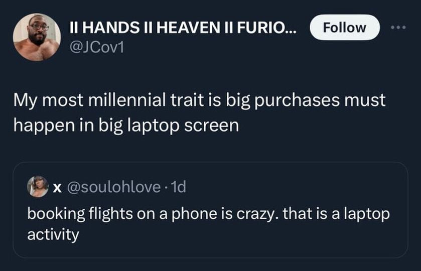
Desktops and laptops make browing a large number of tabs easier and websites dont pare down the options and menus into a useless mess
Theres some websites where I have to look at in desktop bersion on Firefox mobile because theyre useless otherwise. Digikey for example.
Exactly. Why do sites decide "you're on mobile, so you just don't need to ever see such and such piece nformation"? I get that there's limited screen real estate, but at least put that info somewhere, inside a menu or something.
For big purchases you've got to have the desktop version of the websites, you need a mouse for precision pointing and a keyboard for alt+tab-ing between windows, plus you need a spreadsheet open where you can compile all your research.
Or worse, "You're on mobile, you need to download our app to view this content."
Meanwhile you switch to desktop view and see everything normally.