this post was submitted on 27 Jun 2024
1161 points (97.2% liked)
> Greentext
7549 readers
1 users here now
founded 2 years ago
MODERATORS
you are viewing a single comment's thread
view the rest of the comments
view the rest of the comments

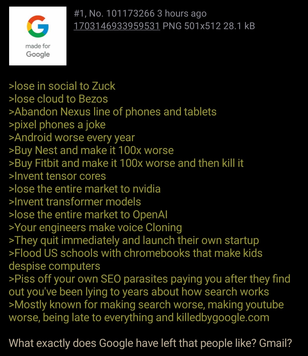
OP technically isn't wrong, there are many UI changes that have made android worse over the years.
Like what?
The drop down that shows the toggles and notifications. I remember when there used to be 6 or 7 toggles at the top before you had to swipe down again to get more, but now, there are 4 huge and frankly unnecessary toggles instead of the previous 6-7 small ones. Also, more and more of google shoving their unnecessary products down your throat that you cannot uninstall.
Yeah, I disliked that when I saw the announcement too. I think the disconnect here is my Android flavour. Since I'm on Samsung, I still have 6 small round buttons at the top (Android 13, OneUI 5.1).