this post was submitted on 06 Jul 2024
564 points (95.6% liked)
linuxmemes
21410 readers
955 users here now
Hint: :q!
Sister communities:
Community rules (click to expand)
1. Follow the site-wide rules
- Instance-wide TOS: https://legal.lemmy.world/tos/
- Lemmy code of conduct: https://join-lemmy.org/docs/code_of_conduct.html
2. Be civil
- Understand the difference between a joke and an insult.
- Do not harrass or attack members of the community for any reason.
- Leave remarks of "peasantry" to the PCMR community. If you dislike an OS/service/application, attack the thing you dislike, not the individuals who use it. Some people may not have a choice.
- Bigotry will not be tolerated.
- These rules are somewhat loosened when the subject is a public figure. Still, do not attack their person or incite harrassment.
3. Post Linux-related content
- Including Unix and BSD.
- Non-Linux content is acceptable as long as it makes a reference to Linux. For example, the poorly made mockery of
sudoin Windows. - No porn. Even if you watch it on a Linux machine.
4. No recent reposts
- Everybody uses Arch btw, can't quit Vim, and wants to interject for a moment. You can stop now.
Please report posts and comments that break these rules!
Important: never execute code or follow advice that you don't understand or can't verify, especially here. The word of the day is credibility. This is a meme community -- even the most helpful comments might just be shitposts that can damage your system. Be aware, be smart, don't fork-bomb your computer.
founded 1 year ago
MODERATORS
you are viewing a single comment's thread
view the rest of the comments
view the rest of the comments

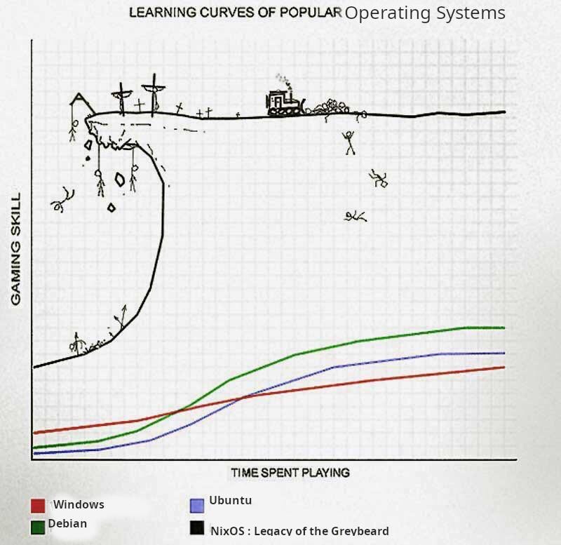
Does this graph mean what it is supposed to mean for the joke to work? The black line means I learn much quicker with less time investment, i.e. it is easier than all the others.
No it means that it requires much more skill earlier in the progression.
That is a common misunderstanding of how learning curves work. A steep learning curve means your skill increases more rapidly with the invested time. That means the subject is easier or more intuitive.
'If you change the axis then it makes sense' is not a great argument 🙂 but it does not matter, it is just a joke after all, so let's not argue. Have a nice day y'all!
Huh? I thought the original chart means I get more gaming skill from playing EVE than from playing WoW - which totally makes sense
It is clearly meant to be graphing the difficulty of the game VS time played. The graph means what the author designed it to mean.