this post was submitted on 15 Oct 2024
273 points (90.7% liked)
Gaming
3161 readers
107 users here now
!gaming is a community for gaming noobs through gaming aficionados. Unlike !games, we don’t take ourselves quite as serious. Shitposts and memes are welcome.
Our Rules:
1. Keep it civil.
Attack the argument, not the person. No racism/sexism/bigotry. Good faith argumentation only.
2. No sexism, racism, homophobia, transphobia or any other flavor of bigotry.
I should not need to explain this one.
3. No bots, spam or self-promotion.
Only approved bots, which follow the guidelines for bots set by the instance, are allowed.
4. Try not to repost anything posted within the past month.
Beyond that, go for it. Not everyone is on every site all the time.
Logo uses joystick by liftarn
founded 1 year ago
MODERATORS
you are viewing a single comment's thread
view the rest of the comments
view the rest of the comments

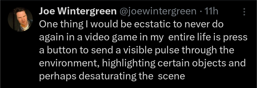
If you don't like it, don't press that button
As I'm getting older, I'm definitely starting to appreciate that I just can't see shit. If the game's going for an ultra-realistic environment, then there's just so much more visual clutter that I need help picking things out.
In my opinion, it's just an accessibility feature. Those are always nicer to have than to not. But if you're a purist, or you don't have any problem finding things, then I'd also hope you'd be able to disable it.
The problem is that games are designed for it to be used. I hated using Witcher senses in Dying Light 2, but good look finding lootables without it. It’s a cop out solution.
It really depends on the game, you can't put all games under an umbrella and say it's all bad. I love the ones in Starfield, warframe, No Man's Sky, Assassin Creed Origins and Odyssey and many more. As long as it has actual uses more than just highlighting stuff and/or is well designed it's always welcome IMO. Haven't played DL2 yet but I really can't think of any game where it felt like a cop out for otherwise bad design.